Wednesday, March 31, 2010

Wednesday Sketch Challenge

Can you believe this is the last day of March? Here in Minnesota it went out like a lamb. Not really sure what that meant. I think it came in the same way too! It's springtime in Minnesota. A bit early but that's ok, most of us are ready for it. Me, I still like winter but I will manage to make it through this beautiful spring weather!

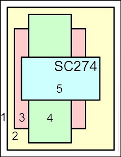
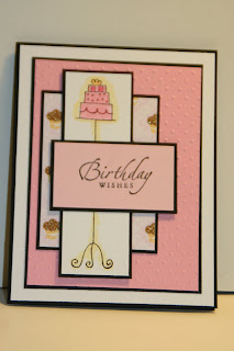
"It's a Stretch"! That's the Stampin' Up! set I used in this weeks Sketch Challenge at SplitCoastStampers. This sketch had lots of layers which you all know is something I REALLY love! The more the better. I love it until it comes time to mail the card!!! LOL

I don't use this set much at all. I think I bought it because of the adorable Christmas stocking in the set. I need to stop buying a set because of one image in it. Oh my, how many times have I said that? I guess I could say it until I'm blue in the face and I would still buy a set because of one image! I will never learn!

Anyway, back to this fun card. I used the Dotted Swiss embossing folder on the Pretty in Pink background. The cupcakes paper are from a huge DCVW pack. I also used the "Sincere Salutations" set for the Birthday wishes. I stamped that on a scrap piece of Pink Pirouette card stock I couldn't believe I still had. But it went with the card perfectly. I wanted that piece to be pink but a very light pink. My other option was to sponge in the pink until I got it the color I wanted. But fortunately I got to take the easy route when i found that scrap of Pirouette Pink. Lucky me!

I colored in the cake with a Pretty in Pink marker and I gave it some highlights using the Regal Rose marker. I took the Barley Banana marker and went around the image to give it some color. just coloring in the cake was not enough, it looked too blah. This brightened it up and it also pulled in the yellowish color from the cupcakes paper.

All in all this was a pretty quick card to make. I think it took me longer to cut all the card stock than it did to color it and put it all together. Ok, the taping did take a while to do. But the whole card was done in less than 20 minutes!

Such a fun sketch. If you have time play with this card layout. Go over to SplitCoastStampers and see what the other gals did with this layout. That is the funnest part of this to me. I LOVE seeing how much different a card can look with working from the same layout. It's amazing and it's fun to see how creative these other gals are!

Thank you SO much for visiting today,
Wanda


Tuesday, March 30, 2010

Happy Together Card

I just love this cute little quail set. It's called "Happy Together" by Stampin' Up! I always think of the Partridge family when I see this set. Is it a quail or a partridge? I'm thinking it's a quail. Do partridges have that "thing" on the top of their head? I haven't a clue! I just like the set.

My friend Denise make this card. I just love how she did the front part of this card. She used the Scalloped Square die. The card stock was folded and then cut. The top fold was put far enough down into the die that it wasn't cut.

It's such a cute and sweet card and I just love the layout. I have plans for that layout with other stamp sets. I have plans for lots of my stamp sets. Just with I had TONS of time to play!

Isn't this just the cutest card? I am SO fortunate to be among such wonderful talent!

Thank you Denise for letting me post your fabulous card on my blog!! You're famous too!

Thank you for visiting today,
Wanda

Monday, March 29, 2010

3D Technique

I can't believe I'm starting my fourth set of Technique Pages! WOW, that's a lot of techniques and there's still many more out there. I have a very long list of ones yet to do. Some techniques are very old ones but none the less they are a technique and in good time will go into the book! I even had to start a new album. My album only held three sets, 60 pages. I suppose I could add a few more pages but I don't what the album to bulge. Fortunately I have another 6" x 6" leather album so I'm set. I have one more but it's got my recipe pages in it. But if I have to sacrifice the recipe pages to make room for the technique pages I will!

Anyway, onto this fun technique. You need to use two different color inks to make the image look like it's 3D. This would be fun on the background of a card or scrapbook page.

Just a reminder here. I finished the third set and it is ready for sale. You can email me if you are interested in purchasing a set of these finished pages. I will be adding them to my web store next week so it will be a lot easier to purchase. The store figures out the postage and everything for you. I have not mastered how to work the store. I am capable of entering an item but I do not know how to work with the photo. It's got to be sized a certain way and I have not learned how to do that yet. But I'm sure I will and then I will be posting a lot more things quicker!

The best part about this technique is that I have it all done and boxed up! I had to spend some time in the hospital waiting room on Thursday so I brought some stuff to work on and I completed these pages plus part of the next technique page I'm going to be posting. I am hoping to post a page every week to ten days. The problem with the pages is getting them all put together. I make a lot of copies of the technique and there is a lot to putting one together. I LOVE to sponge the edges and that takes time. There is the typing of the page, the stamping on the background. Making the technique over and over and over so I have enough for each page I'm making and then putting those pieces on the page itself. Then the page is layered on top of a piece of coordinating card stock. Once all that is done they go into a box, a label goes on the box and it goes into a larger box to wait for the rest of the techniques in that set to be completed! Making one page doesn't take much time at all but to make a bunch of them takes a lot more time and I tend to make the pages, cut all the parts for it and put that in a box. Then when I have a road trip or have to sit in a waiting room I will put together the pages. And then there are times where I just have to sit at my worktable and put together pages so I don't get too far behind! I don't complain about it, I like making them but I do get a bit stressed when I get down to the last page or two and I have several boxes of pages that need to be put together. And there you have it, the technique page making saga! Aren't you glad you know? LOL

Thank you SO much for visiting today,
Wanda

Sunday, March 28, 2010

Sharon's Bunnies Card

Sharon is one of the gals who comes to my home to stamp. She is such a sweetie and we all love to hear her stories! She's such a delight. She is a very good stamper too and don't let her tell you different!

Isn't this bunny card just the most adorable? I think it is absolutely the sweetest!!! And I think she did a fabulous job on it.

Materials used here:

Happy Easter is from the "Well Scripted" set by Stampin' Up!
The Four Bunnies is by Hampton Arts
White card stock
Melon Mambo card stock
Melon Mambo ink
Melon Mambo Polka Dot ribbon

This is a very easy and fun layout to play with. I have used it many times and I was glad that Sharon liked it and was able to use it on her cards!

Didn't she do a fabulous job?

Thank you for letting me post your card on my blog! You're famous Sharon!!

Thank you for visiting today,
Wanda


Saturday, March 27, 2010

Thoughts and Prayers Card

Ok, I had finally gotten my Stampin' Up! butterfly Sizzlet and hadn't played with it. Last week one of my stampers had used it and I was SO jealous!!! SO I finally made a card that I thought the butterflies would look great on and it did. Don't you just love it when what you see in your mind actually looks great on the end product? I was pleased at the way this card came out.

It was a very simple card to make too. I do have one regret on it. I should have used Rich Razzleberry card stock behind the image piece instead of the polka dotted decorative paper. The only part of the dots that show are at the very top and they look out of place. Oh well, once you tape decorative paper the odds of getting the tape to come off nicely is rare. I have better luck when it's card stock taped to card stock than card stock taped to decorative paper. SO I just left it as it was. It's still pretty just not "perfect" like I wanted it to be. UGH, I gotta give up on this perfectionist stuff!

SO once I got the card done I could see that the front of it needed just a bit more and that is where the butterflies came in. The fit well with the theme of the card. The flowers on the card and butterflies certainly do go together!! These are the smallest butterflies in the die and they were just perfect for this card! I didn't think I would love that die as much as I do! I'm going to be having fun with it. Spring is around the corner and soon the real butterflies will be out. I hope to get some photos this year and I want to scrapbook them and add these butterfly dies to the pages. These will be used on a lot of my projects this coming spring!

This card can be used for many other occasions too. Like Birthdays, Sympathy (of course, that is what the set was designed for), Get Well, Mother's Day and Friendship.

Thank you SO much for visiting today,
Wanda

Friday, March 26, 2010

Magnetic Card Holder and Cards

I was going to just make one card and this is what I ended up with. I did make the card. I was going to leave it blank on the bottom to stamp what I needed when I needed it. But then I thought I would just go ahead and stamp on it and make another card and leave it blank. Well, I had the Stampin' Up! "Sincere Salutations" set out so why not make another card and use the stamps in that set?

First is the picture of the four cards I made. I took the Stampin' Up! "Boho Blossoms" punch and the "Sending Love" designer paper to do the "flowers" across the tops of each card. No stamping involved there at all. Just some punching, some pretty paper and brads!

Next I centered the Pretty in Pink satin ribbon on the front of the card panel. In doing that it left me the bottom half for the words. I made the birthday card you see, a thinking of you card, a get well card and a thank you card. A variety that is commonly used. I thought about using one of those card box patterns that are around on other blogs but then I thought I should design my own and that is exactly what I did.

The front of the box is done using the "Sending Love" designer paper and a ribbon is wrapped around the layers and a bow added. It made it just sweet enough to be cute!

The inside of the holder is set up for one side to hold the cards and the other side to hold the envelopes. And it all folds up like a wallet and it stays closed with a magnet.

The pattern is available in my web store. You can access it by clicking the link at the top right of the sidebar or you can click here to go to the store. You can use these for Stamp Camps, Craft Fairs, Hostess Gifts and Customer Appreciation Gifts. These would also make a great teacher gift too!

The pattern has diagrams, photos and step by step instructions for you to make your own card holder. You can decorate it as you wish and make coordinating cards to go with it. They really do make a lovely gift!

Thank you SO much for visiting today,
Wanda

Thursday, March 25, 2010

Sweet Pea Stitched Felt Flowers Card

I am so loving these Sweet Pea stitched felt flowers. I certainly wouldn't want to make my own! That stitching on them is so darn cute but I could not see myself sitting at my sewing machine sewing those! But as long as someone else took all that time to sew them I feel that I MUST use them!

As you can tell I'm using the same decorative papers as I did in my card yesterday. I guess that means I didn't put the paper away when I was done! I don't like to put stuff away. I have better things to do than clean up after myself! LOL Doesn't it save time to just put it all away when there is no room left to work? I mean why put it away when you are finished with it? Are you really finished with it? See I even save time and steps by not having put it away, it's at arms reach for the next time I need it! There is a means to my madness!

Ok, onto this card. This was a very simple card to make. The original was done by Julie at "Kewl" Stamps-n-more. She's got a few more cards on her blog I want to CASE if and when I get time. But for now I just CASED her felt flowers one. I did mine in different colors but it's still her layout. I also didn't have the stamp she used for the stems so I just drew mine in with an Old Olive marker. See, I can actually make due without! Hers was an Easter card and I made mine into a Birthday card. Isn't it just a sweet card? And OH SO easy!

Thank you SO much for visiting today,
Wanda

Wednesday, March 24, 2010

Wednesday Sketch Challenge Spring Song

Last week one of the gals who was over stamping (Kay!) was using my Stampin' Up! "Spring Song" set. She had stamped and colored the humming bird. Now I originally bought this set because of the other bird. I'm not sure what type it is, it sort of looks like a robin but could be a blue bird too! Anyway, I had plans for that bird. Now to date I still have not used that stamp for the project I had in mind. Now when the Sketch Challenge was posted at SplitCoastStampers that set was sitting on my worktable and I placed the circle piece over the robin type bird and thought I would go with that one. I did stamp one, embossed it and began coloring it in but I was not pleased with the way it was going. Then I thought I would give the hummingbird a try. I like hummingbirds but they are not among my favorite birds so to color it was an effort to me. But I managed and I was pleased at the way the colors came out. I even went online to see what colors hummingbirds were. Well, I found out there are a lot of different kinds and shapes of hummingbirds. I did not know that and that find was of no help to me! SO I shut down the computer and went to my other worktable and started to color on my own!

On my card I used the Old Olive decorative papers a small piece of Old Olive card stock and Whisper White. I always seem to layer black on my cards when I do these sketches. I just think it makes the other colors pop.

I colored in the flowers with my blender pen and the Melon Mambo marker. Then I came back in with the Rich Razzleberry marker and darkened the flowers. The bird has many colors in it and honestly I don't think I can reproduce it!

I cut out the bird and set it in place with Dimensionals. If I would have just taped it in place it would have laid funny on top of that circle layer.

I do like how my card turned out. And the biggest shocker here is that I didn't use the "Vintage Vogue" set!!! LOL

This card can be used for a lot of different occasions. Gotta love that when you make a card you aren't going to be using right away!

Thank you SO much for visiting today,
Wanda

Tuesday, March 23, 2010

Quick and Simple Get Well Card

One of my all time favorite word sets has been the Stampin' Up! "Sincere Salutations." I have always loved the font and the choice of words in the set. They seem to cover the occasions I needed them to. Plus they actually look like they belong on a card. Hard to explain what I mean there. They just look like a greeting card font!

This card is very simple to make. I just took a half sheet of white card stock and cut it at 4-1/4" on the short side. I folded it in half.

The Melon Mambo piece was cut at 4-1/8" x 3" and the center white piece was cut 4" x 2-7/8"

I stamped 4 flowers from the "Vintage Vogue" set and cut them out. I am SO loving that set too!

I used my piercing tool and poked a hole in the center and added a brad. Behind the flower is a Dimensional. I like to use these when a brad is used. It's sticky enough to hold the brad to the paper and card. If a Dimensional is not appropriate then I will use the Stick Strip tape but just a little piece, that stuff is VERY sticky and when you put it down you'd better be sure where you want it to be because there is no going back with that stuff!

On the center of the layer I added a piece of Melon Mambo Polka Dot ribbon. Below that is where I stamped the words using Melon Mambo ink.

This layout is very simple to work with and you can use it for many occasions. This would make a wonderful thank you card, birthday card, thinking of you card and even a pretty Mother's Day card.

I have a fun project coming up this week using this layout so stay tuned!

Such a simple card and a VERY quick one too!

Thank you SO much for visiting today,
Wanda

Monday, March 22, 2010

Scalloped Envelope Box Weekend Project

With Easter right around the corner I thought I would make a basket. I wanted to make the basket because I thought that not everyone would want to have Easter baskets around that they would have to store. These are great because you can leave them as they are or add a handle, either way they are a basket!

For my basket I used a piece of Stampin' Up! decorative paper from the "Cottage Wall" pack. You need 4 pieces that measure 5" x 5-1/2" each and you need the Stampin' Up! "Scalloped Envelope" die. You cut out 4 and tape the sides all together. The bottom is done by folding a flap over flap. I didn't do mine that way. I just taped them together flat and placed a piece of Rich Razzleberry card stock in the bottom of the box. It gave the base a bit more stability and it is smooth on the inside.

I taped the flaps down on the sides and on the front I added white brads. I also added a border around the bottom. It was created using the Stampin' Up! "Scallop Trim" border punch.

This box was very easy to do. The most difficult part was deciding what paper to use! Seriously, it was a very quick project. You can make it a longer project if you'd like. Add a handle. Add some ribbon around it. Attach a design image. There's LOTS more you can do to make it a longer project. It's all in how much you want to embellish it! I opted for quick and easy since it was my very first Scalloped Envelope box ever! Yup, ever! I'd seen them around on SplitCoast and on other blogs but I had never had time to give it a try. And that was just too bad because it was so very quick and easy! But now that I know that I will make them for other occasions.

You can find the tutorial on how to make this box at SplitCoastStampers. This link should take you directly to the instructions.

Thank you SO much for visiting today,
Wanda

Sunday, March 21, 2010

FYI Card

This is another card I had made at Sue's "Card Buffet" last month. It's among my favorites.

I LOVE the colors (Rich Razzleberry and Melon Mambo) in this card. The Rich Razzleberry just makes the Melon Mambo just pop, doesn't it? And that white on the left side is the "Bride" specialty paper.

I LOVE the layout of this card too. I don't have this set but I can do this layout with other sets I have.

This is another one of those really quick cards you can whip up in a few minutes, pop it in the envelope and off you go! Not that I ever do that!!! LOL

This card layout is unique. The FYI is attached to the "Bride" paper and that is the front of the card. The Melon Mambo card stock you are seeing is actually the inside of the card. You can write within that square area of the FYI and it won't show above or below the FYI panel. I just think it's a fun layout to try. And it is even nice if you were to tape the FYI piece on top of the Melon Mambo and make the front of the card a solid piece. I don't think there is a way to make this layout ugly! Oh wait, I bet I could!!! LOL

It's a fun and quick card and not to mention pretty too! And it's very versatile too. You can use it for many other occasions. I love that in a card and layout.

This week I have some fun projects coming up so be sure to stay tuned!

Thank you SO much for visiting today,
Wanda


Saturday, March 20, 2010

Quick and Sweet Thank You Card

Not only can you use this as a Thank You card but you can use it for several other occasions too. I love it not only when I find a stamp set that is versatile but when I find a card layout that is too! And when you combine the two of them, well..... need I say more?

This is a card I made at Sue's Card Buffet last month. I never did get through the group of cards I had made. Isn't it just a simply sweet card? And do you see how easy it is to use this card for other occasions too?

I love that decorative paper. It's from the Stampin' Up! "Groom" speciality paper pack. It's not that I'm hoarding that paper, it's just that I have not used it much in my cards. I'm sure I will use it more when I find a card or layout that I think it will go well with. And with a card like this, the piece is so small that you'll still have lots of paper left over for other projects!

I don't know the name of the set used here. I need to start writing that down when I do these cards. SO much time has passed since I did them that I barely remember doing them!!!

You can even change the colors here (using this layout) and make this into a masculine card without the flowers! A quick card all around!

I just love the simplicity of this card and I also love how quick it was to make. If you need a quick birthday card you can whip this one up in no time.

Thanks Sue for the fun card with the fabulously quick layout!

And thank you for visiting my blog today,
Wanda

Friday, March 19, 2010

Sandi's Bunny Card

Wednesday one of the gals that were here stamping made this adorable bunny card.

She cut white card stock for the face and ears. The nose and inside the ears was sponged in.

The background is from the Stampendous set "Egg Boarders".

The words are from the Stampin' Up! set "Well Scripted." Don't you just LOVE the font? It's so elegant looking.

Isn't this just an adorable card? When (I never mention names here, do I? LOL) Sandi finished her cards I told her I just had to take a picture of it. I thought it was just TOO darn cute not to share it.

Thank you Sandi for allowing me to share your wonderful card with the rest of the world!

And I thank you for visiting heJustify Fullre today,
Wanda

Thursday, March 18, 2010

Jelly Beans in a Cup!

As I was cleaning up this HUGE overwhelming mess I have in our tv room I ran a cross these containers I had purchased empty from Stampin' Up! It was nice to just take the containers out of the package and be able to use them right away as opposed to using up the "stuff" in a container and peeling off the label. And it's such a great time saver too!

I filled these containers with gourmet jelly beans and then over to my stash of decorative papers to find some I could use that would look wonderful on top of these containers. I used the "Shades of Spring" designer paper and the "Flower Daisies #2" die cut. I cut out two flowers to make the one flower you see on the container. I stuck them together with mini glue dots and the same with the buttons. I used two glue dots stacked on top of each other. I had to do that because one wasn't thick enough to touch the plastic lid because of the thickness of the papers. Now if I didn't have the glue dots on hand I would have used Crystal Effects to stick all of these together.

Aren't they adorable? I made a dozen of them all together and they really didn't take that long to make. I haven't played with that die as much as I'd like to. I do have some ideas to do with it and can hardly wait to find some time to see those ideas in real life!

These make great gifts for the kiddies, teachers, friends, neighbors, etc. And they are easy to make too! You can get the kiddies to help make them, if they promise not to eat the jelly beans until you are all done!! Good luck on that one!

Thank you SO much for visiting,
Wanda

Wednesday, March 17, 2010

A Vintage Vogue Wednesday Sketch Challenge

This weeks Sketch Challenge at SplitCoastStampers was a lot of fun. It had lots of layers, which is something that I just LOVE! The more the better! Only if I'm not making more than 4 of them at a time! If you have time go on over there and give the sketch a try. They give measurements if you need them. Personally I just eye it and whatever fits in the spaces is what I use.

For my card I used the following:

Basic Black card stock
Very Vanilla card stock
Rich Razzleberry card stock
Razzleberry Lemonade decorative paper
Vintage Vogue set
Teeny Tiny Wishes set
Word Window Punch
Label Punch
Extra Large two step Bird punch
Dew Drops
Rich Razzleberry ink
Old Olive ink

I printed out the sketch and eyed my measurements from there. The printout is pretty close to exact size. I just LOVE that.

I cut the flowers out, not one of my favorite things to do and I sure have cut a lot of these flowers lately. Hmmm, maybe I really like this set??? Ya think!?!?

I sponged my edges with Rich Razzleberry.

I needed a get well card and tomorrow this will be going out in the mail. Because of the dew drops I will have to pay an extra 20 cents because they made it non-machinable. I finally got that postage stuff straightened out. If your envelope is normal it's just 44 cents. If you have brads or other hard items on it that could cause their machine to jam it's an additional 20 cents. If it is more than one ounce it is an additional 17 cents. SO if your card is over an ounce and has brads, etc. on it you will be paying 81 cents to mail your card. Not too bad if you are only sending out a few a month. I certainly wouldn't want to pay that for Christmas cards!

SO there you have it, a card and a lecture on postage! LOL

Thank you SO much for visiting today,
Wanda

Tuesday, March 16, 2010

Beautiful Butterfly Thank You Card

Isn't this card BEAUTIFUL? My fellow demonstrator Denise made it for me. She's SO sweet and thoughtful.

I LOVE the Rich Razzleberry card stock behind the Crushed Curry. And of course the Razzleberry Lemonade decorative paper.

I am not sure what Stampin' Up! stamp set this is. It's obvious that I don't own it! YET!

I LOVE butterflies and have been surfing the net to purchase Monarch larva but have not had much luck. But I haven't spent much time searching, just stealing a few minutes away here and there.

Anyway,back to to this wonderful card. The front of the card is the Razzleberry Lemonade decorative paper and the three layers with the butterfly on it. It is not a solid card front. I have never made a card with that type of layout and I'm going to have to give it a try because it has such a stunning look to it.

Isn't it a sweet card? Without the "Thank You" on it you could use it for many other occasions too. And yet another reason to buy this stamp set!

Thank you Denise for the wonderful card and for allowing me to share it on my blog!

Thank you for visiting today,
Wanda

Monday, March 15, 2010

White on White Two Step Bird Punch Card

I'm a little late in posting tonight. My day just got away from me. I spent my early afternoon teaching at the local bead shop. A very fun time. I love misdirecting people! LOL I enjoy beading and it is fun to teach it too. I wish I could spend my days beading, stamping and playing with clay. I wish, I wish, I wish. Do you think saying it three times will make it come true? I wish! LOL

Ok, onto the card for today. I had been blog surfing and last week someone had a "white on white" challenge. Well, as you can see with my card, the "white on white" is still a challenge. I just couldn't do it. I had to sponge the edges to define the images.

I had the make of the website I found this layout at and of course I lost it in my mess. When I find it (if I find it) I will give credit where credit is due. Her card had a bird image stamped on it and it was colored in lightly. I'm sure I will find it so you can see her beautiful card.

For this card I used the new "Extra Large Two Step Bird Punch" and the "Scallop Trim" border punch.

I ran a piece of white card stock through the "Dotted Swiss" embossing folder.

There's a bit of satin ribbon here and a clear rhinestone brad from the "Pretties Kit."

I took a very fine foam brush/dauber type thing and sponged the edges. With it I was able to sponge lightly and get into the crevasses of the leaves without bending them.

It's a very lovely and elegant look and I'm sure it would be pretty too without the sponging. I'm sure I'll challenge myself to do another white on white card someday soon.

Thank you SO much for visiting today,
Wanda

Sunday, March 14, 2010

Happy Moments Birthday Card

I had gotten this Sale-A-Bration set "Happy Moments" and hadn't played with it. I have a few other sets like that. I have them and some of Justify Fullthem I have even put together and have not used them! What is wrong with me? Ok, we won't go into that, we don't have all day here! LOL

I especially wanted this set for the cute flower trio on it and the first image I use is the package!!! Odd, huh? You could even use that image on a Christmas card!

For this card I wanted to keep it simple. Simple is good!

I took a piece of Crushed Curry that was about 3" wide and punched the border. When doing this, pay attention to the front side and back side of the card stock. I punched it on one side and when I went to do the other side I turned it over and now I have raw edges showing. It doesn't show much but I know it's there and of course I had to put the raw edges on the left side so it shows them all instead of turning it around so only a few of the scallops show. DUH!

I layered a strip of "Shades of Spring" decorative paper on top of a piece of white card stock. I tied a piece of Crushed Curry polka dot ribbon around the three layers before I taped them on top of the card.

I stamped the package image using black StazOn ink and colored it in with markers. The center piece was stamped on a scrap of Crushed Curry and cut out. Then it was set in place with Dimensionals. The image piece was layered on top of a piece of Crushed Curry and that was set in place using Dimensionals.

The words came from the set and were stamped on Crushed Curry. I punched them out using the Word Window punch. I was going to wrap it around the edge of the card but it didn't look very nice so I taped it on the front and cut off the excess.

Oh and on the white I used the "Dotted Swiss" embossing folder but I only put the card stock in it part way so I still had part of the card stock smooth.

That's it! There isn't really a lot to making this card. When you use embossing folders and decorative papers there isn't a lot left to do on a card! Gotta LOVE that!

This card is for hubby's aunt! Her birthday is on the 18th. And with this card I am now officially caught up with birthday cards for the month! I still have a few other ones I need to get out but that will have to wait until later in the week. These days are just flying by. I can't believe we are already in the middle of the month! Didn't March just start?

Thanks SO much for visiting today,
Wanda

Saturday, March 13, 2010

Vintage Vogue Birthday Card

No, I still have not put this stamp set away. I just love it and am having a lot of fun with it. It's an extremely versatile set too. It starts out as a "Friend" type set but can be used to make birthday cards, thinking of you cards, sympathy cards and get well cards.

Today I made mine into a birthday card for my sister. And it's obvious I still have not put away the "Well Scripted" set either! I know I've said this before but I just LOVE the font on this set. It's very pretty and elegant at the same time. But it's not too pretty to use on a masculine card! It's just perfect!

For the base of my card I used Basic Gray card stock. On top of that is a piece of Rich Razzleberry cut 4-1/8" x 5-3/4". The flower was stamped on a piece of Very Vanilla cut 2-1/4" x 2-1/4". The edges were sponged in Rich Razzleberry. That piece was layered on top of a piece of Basic Gray measuring 2-1/2" x 1-1/2".

The Old Olive piece was lightly stamped with the leafy image, allover the card and the edges were sponged in Old Olive as well. That piece measures 3" x 3-1/2". The Basic Gray piece behind it measures 3-1/8" x 3-5/8".

The Rich Razzleberry dotted ribbon was added before the Old Olive piece was taped in place.

I punched out a little Going Gray flower and put in the center of the large flower. I punched out a 1/4" vanilla circle and put it in the center of the little gray flower. After the photo was taken (this is when I am the most critical of my cards... somehow seeing them on the computer I see more things I could have done, should have done or should not have done!) I added a dark pink rhinestone. It is so dark that it actually looks like the Rich Razzleberry color. It really made the card look finished! And fortunately I will be hand delivering this so I won't have to pay the extra postage involved in this one.

Now I need to make one more birthday card, 2 get well cards and one thinking of you card before the end of the month! I am very behind on my cards. UGH!

Anyway, this was a fun and pretty quick card to make.

Thank you SO much for visiting today,
Wanda

Friday, March 12, 2010

Fancy Favor Die Cut Easter Basket Weekend Project

Sorry for the late post, I was wanting to play with the Sizzix die cuts tonight and thought I would make an Easter Basket. I even managed to get a Sweet Treats cup to work with it too! I got so wrapped up in playing I lost all track of time. So onto the specs of the basket!

I cut the basket out using Pale Plum card stock. The handle is made using a strip of the Pale Plum with ribbon on top. It is attached using white brads.

I tied a white ribbon at the bottom. It just looked like it needed a little something there.

Before I assembled the box I punched a round hole in the middle of the front part and added the Sweet Treats cup.

For the scallop around the Sweet Treats cup I used Scalloped Nestabilities for both the white and the "Shades of Spring" decorative paper.

The little bunny on the bottom right is from the Stampin' Up! "Eggcoutrements" set. That set has an adorable border image in it and I wanted to use it on the bag but I didn't have enough room at the bottom for it. I'm sure I'll find something else to use it on!

I added some fun colored paper Easter grass inside and and added the candies.

When making this don't fill the Sweet Treats cup until you are ready to finish the whole bag. Mine kept falling over and it bent the one corner of the bag. Once it was filled with the paper and candies it balanced out and stood up nicely.

Isn't it cute? What a nice way to brighten up a co-worker's desk or even a great teacher gift! Lots of people you can give this to!

Thank you SO much for visiting today,
Wanda

Thursday, March 11, 2010

Three Purses Card

Here is a fun card I made for my stampers to do if they wish. I don't remember where I saw this layout. The one I saw was in blues. It was very pretty but I didn't have the blues that they used so I thought I would go with the black and white look. It's a fun look and I usually don't do black and white so it was a bit of a challenge for me too.

I used several punches here to make the purses, including the handles, flowers and closures. Brads were added to the front of each purse and on one of them I used the white gel pen to add a few dots.

The base of the card is Basic Black. The next layer is the "Night & Day" decorative paper. I had some left and thought I would use it up. I didn't succeed, I still have some left! On top of that is three layers. A black layer, a gray layer and a white layer. The white layer was embossed using the Dotted Swiss embossing folder. A ribbon was tied around the three layers before they were taped in place with Dimensionals.

The words are from the Stampin' Up! "Oval All" set. It's an adorable set but I don't use it as often as I'd like to. The original card used that set and I did to because it fit nicely in that space. If you know how make the original "Three Purses" card please let me know so I can give them credit.

Isn't it a cute card. I just loved the original one and this one in black and white did turn out cute too. It sure does have a LOT of pieces to it though! But SO worth it!

Thank you SO much for visiting today,
Wanda

The Bracelet! Beaded Bracelet

I forgot all about posting the bracelet I finished on Sunday when I was teaching at the local bead shop. I LOVE this bracelet. A lot of the students did it in two different colors of seed beads. It is very pretty like that too. On mine I just used silver lined gold and the "eye" of the peacock part is an Amethyst Swarovski bicone. Those bicones are SO pretty. The cut of them catches the light just right and gives them an even richer look to them. I will be putting this bracelet in my web store. I need to get the photo to the webmaster so he can re size it and post it for me. You can find more details about it there in a couple of days. It will fit a 6-1/2" wrist. When I teach I give each student a strip of paper and have them wrap it around their wrist and cut it exactly the size of their wrist. This is how big they make their bracelets (if it's for them) and adding the clasp and clasp beads creates enough length to allow the bracelet to have some movement on the wrist but not be tight. You write your name on these strips or the name of whoever's wrist you measured and put them in an envelope and you will always have their measurements and can make them a gift without giving the secret away! I have several slips in an envelope with friends names on them. But I haven't made too many from that envelope! Maybe come Christmas. But I have all summer to think about that one, huh? Click on the photo for a closer view. Anyway, watch the web store in a couple of days for the bracelet info.   
Thanks SO much, Wanda

Wednesday, March 10, 2010

Wednesday Sketch Challenge

This sketch layout came just in the nick of time. I needed to make a masculine birthday card and this sketch fit the bill. I needed something with a Justify Fulllarger focal point. I SO love this "Two Canoes" stamp by Creative Impressions. I have used it many many times and love the outcome each time.

On this card I stamped the image using VersaMark and embossed it in black detail embossing powder. I used my blender pen and markers and colored in the images. One thing you have to remember to do when coloring with the blender pen on images that are embossed, you need to make sure you blot the surface. The color beads up on the embossed area and you can pick it up on your fingers and transfer it to other parts of your card for a much undesired look. Speaking from experience here. But not on this one! I blotted a lot as I colored and was thrilled with the end results! SO much so that I'm now not sure I want to give it to my nephew! LOL I know, just give it up, it was made with him in mind so just give it to him. It's not like I can't make another one. It may not turn out exactly like this one but I can make another one. Ok fine, I'll give it to him! LOL

I love to do the blender pen and markers in my coloring. It goes on so quickly and if you start with the lightest colors and color in the areas that are the darkest you really can't ruin the picture. You want to start coloring in the areas that are the darkest (in this image, where the canoes reflect on the water, it creates a darker shade, so I would start there). You work your way outward and the pen will run out of color and you just pick up more color and continue. Watercolor paper works the best for this but because of it's texture it is more difficult to get the image to stamp and emboss nicely. Sometimes I've actually turned the watercolor paper over and stamped on that side. It's still watercolor paper on the reverse side, just not textured! Here I used white card stock and because I quickly colored I didn't get any worn spots on my card from overworking an area. I've done this lots of times so I think I've pretty much perfected the "not overworking areas".

If you have time play with this card layout. Another one for my album! I just love going to that album with a stamp image and seeing what layout will fit with that image and I go from there. Sometimes I still put one together on my own but when I get stuck I will take one of those layouts and start from there. Most of the time for me it's a matter of getting started and this is what it takes!

Anyway, I think my nephew will like the card!

Thank you SO much for visiting today,
Wanda

Tuesday, March 09, 2010

Technique Tuesday Technique Page

Yes, it's Tuesday and YES, I have finally finished the last technique page in the third set of pages. I will be emailing those of you who are on my list to let you know they are ready and for those of you who would like a set you can email me and I will be in contact with you. These are on a first come first serve basis for those of you not on the list. The CD will not be available until all the physical page sets are sold.

So with that out of the way, here is today's technique. It's called "Breaking News". I saw a card on someones blog but they didn't say what it was or how it was done. SO I thought I would give it my own try and my own version of it. If it is different than on that card I saw posted then that's even better! But if it's the same then I will need to give someone credit, it's only fair! I no longer show the technique page, they all seem to look alike anyway. I thought I would start showing samples of what you can do with the technique. The pages will be make like before just not posted on here. In the web store there will be a group photo of the pages.

To do this technique you obviously need some newspaper. I prefer to head towards the Variety section since some of the words do show through and you certainly wouldn't want to give a get well card to someone with the Obits showing through, see what I mean. Pick and choose the sections of the paper that would best fit the card you are making. You can head to the card for sale part to make a masculine card, that would be SO appropriate! You know what I'm getting at here so we'll move on.

I next embossed my image and heat set it. I brayered on some ink and I did turn it over and brayered ink on the other side just to make the words even darker so the embossed spot would show more. And it did. I cut it to fit my card and that was pretty much it. You can use it as a background or a focal part of your card. There's LOTS of things you can do with this but the main thing is to have fun!

On this card I used Soft Suede, Crushed Curry, Always Artichoke and Whisper White card stock. I used the Dotted Swiss embossing folder, the 1-1/4", 1-3/8" and Scalloped Circle Punches. The words are from the Stampin' Up! "Holiday Blitz" set (one of my favorite sets) and Soft Suede ink.

Now I'm off to put together the rest of the pages to this technique. It takes me a while to get the pages done because I'm not just doing one, I'm doing quite a few more and after looking at that same page being done over and over and over again I begin to NOT like the technique!

I will be contacting those of you on my list in the next two days. I need to go into my archives and find the list. My computer had been reformatted since the last time I sent out that list so I will need to hunt it down. Why do people have to make and send out viruses? Isn't there enough going on in life than to have to deal with stuff like that? Anyway, be watching your in box for my email!

Thank you SO much for visiting today,
Wanda

Monday, March 08, 2010

A VERY Ugly Thank You Card!

I told you, I share with you my successes and my failures. I have no idea where I was going with this one. I think what I had in mind was the four squares and this is where it took me. . . . down the road of UUUUGLEEEEEE! And this is also a reminder to you that I do not always stamp perfectly, my cards and projects do not always turn out nice or pretty or even straight! I have days when what is in my head just does not work out well on paper! Today is one of those days and lucky you got to be here for me to share it with you!

There are a couple things I can say about this card. It does have the four squares that I was wanting to work with and it is VERY colorful! Perhaps a different color or design on the background might help? Or is this one of those cards that there is no help for?

As I am writing up this post and got my first paragraph done I thought I would pull up the photo and paste it to the blog. I keep looking at it and it's kind of like a train wreck, you don't want to look but you can't take your eyes away!!! LOL

SO as you can tell I am not pleased at all with this card. But the week ahead has better things for you! One of them includes that last technique page in the third set! For those of you waiting, this week will be the one! Woot! Woot!

Yesterday I was at the local bead store teaching. Tomorrow I will show you what the class made! You are going to LOVE it! See, I told you, LOTS of fun stuff this week!

Thank you for visiting today,
Wanda


Sunday, March 07, 2010

Vintage Vogue Mini Notebook Weekend Project

I'm still playing with that "Vintage Vogue" stamp set. I just can't get enough of it. I am loving all the things you can do with it. And another thing I LOVE making is these little notebooks. After I got this one all taped together (with some REALLY super sticky tape) I noticed that the front could have used some sponging on the edges. h well, TOO late for that now!

The cover of my little notebook is Rich Razzleberry. Oh and I say little because it is only 2-1/2" x 2-1/2". I stamped the branch/leaves in Old Olive. On top of that I taped the large Rich Razzleberry flower which I had cut out by hand. Then I taped a smaller flower (stamped in Pretty in Pink and cut out too) on top of the larger flower.

In the center of the flowers I taped a Sweet Pea felt flower. I am not sure why I did that. I think it's mostly because I like those things too! Do all things need a reason? I don't think so! And as soon as hubby accepts that things will roll a lot smoother for him!!! LOL

This was just a fun little project. You can alter other notebooks and get the same effect. If they are a bit bigger you can add more layers to fill in the space. There's a way to work around that!

Aren't they just adorable? They make great gifts and wonderful stocking stuffers (for those of you who like to craft early for Christmas!). These are fun for Stamp Camps, Make n Takes, Customer Appreciation gifts, Hostess Appreciation gifts and even Craft Fairs.

Thank you for visiting today,
Wanda

Saturday, March 06, 2010

Sweet Pea Stitched Felt Flowers Birthday Card

Now I know I saw this layout somewhere but I can't remember. I guess it's all in what you do with it that is important too!

I used Very Vanilla card stock as my base. I ran it through the "Elegant Bouquet" embossing folder. Then I added a piece of Melon Mambo card stock. It measured 2-7/8" x 3-7/8". I cut a scrap piece of paper from the "Cottage Wall" decorative papers pack and a piece of Whisper White. They were both cut 3-7/8" wide. The length is 2-3/4" before it was punched with the "Scallop Trim Border Punch".

I stamped the Happy Birthday from the "Well Scripted" set. Then I taped the white on top of the "Cottage Wall" scrap. I wrapped a piece of Melon Mambo Polka Dot ribbon around it and taped it to the back to secure it. I was thinking of adding a bow but I knew this one had to go through the mail and it would cost 20 cents more to mail it. I know 20 cents isn't much but when you send out cards all the time it adds up. But the card did need something more than just the strip of ribbon. SO I got out my "Sweet Pea" stitched felt flowers. I just LOVE those things. I'm on my second package already! I used one of the larger flowers. I had a lot of them and it's obvious that I didn't use them much so I thought I would work it into this card. It was easy enough to do since the space it was going in was pretty large. I added a felt leaves and put them on the card with glue dots. I wanted something sticky that would hold and those things seem to be the best for it. And surprisingly so that is all there was to making this card.

This card can be used for other occasions too. Like a Thank You cards, Thinking of You card, Mother's Day and Get well.

Now to get it addressed and ready to be mailed. Oh and get this, I will actually be on time with sending this card out! Shocker, huh? LOL

If you're looking for a quick and sweet birthday card, this is the way to go!

Thank you for visiting today,
Wanda

Friday, March 05, 2010

Simple Yet Sweet Birthday Card

Sue (my upline) on her website displayed the birthday cards she had received. This is a copy of one of them. I thought it was a very sweet card. Simple and quick to make too! I LOVE how Autumn punched the three flowers out on the white card stock and you can see the color behind them. And the brads in the center are a nice touch.

The words are from the Stampin' Up! "Sincere Salutations" set. I have used that set more times then I can count. I've always loved that font and the set contained all the sayings you need!

The colors used here are Rich Razzleberry and Whisper White. The ink is Rich Razzleberry. And the ribbon is Rich Razzleberry as well.

To make this card you will need a half sheet of whisper white card stock folded in half. Cut a piece of Rich Razzleberry card stock 4-1/4" x 3". Cut a piece of white card stock 4" x 2-7/8". I don't know if these are the same measurements Autumn used but these worked for me.

You will also need the Trio Flower punch, 3 silver tone brads and 5 Dimensionals.

Cut your card stock. Punch your flowers. Mine are punched about 7/8" in. Wrap ribbon around the white piece and tape on the back. Stamp words. Set this piece on top of the Rich Razzleberry piece and mark where the brads will go. Punch a hole for each brad using your paper piercing tool. Put the brads on and then tape this piece down on the white card base. Using the Dimensionals set the top piece in place. You are done. That is all there is to this card. How simple, huh? Now I have to go make another one. Good thing I just wrote all the dimensions down! This card is for my sister and I thought I should have one on display here. My stampers like to find simple, quick and cute cards to make. This fits into all three of those categories!

Thank you SO much for visiting today,
Wanda


Thursday, March 04, 2010

Wings of Friendship Card

I chose this Stampin' Up! "Wings of Friendship" set a while ago because I thought it was sweet and I never used it. I didn't even have it put together. Sheeeeeesh! What is wrong with me? It's such an adorable set. SO tonight I thought I would put it together and perhaps make a card with it. Well, I actually accomplished both. Oh and I did put ALL of the pieces to the set together and not just the bird! I've been known to do that.

I have a photo album that I keep all of the SplitCoast Sketch Challenge card layouts in. SO I picked up the bird stamp and paged through the book looking for a layout that would support the image. I got to SC75 and stopped. I told myself to pick the first one I come across that works. I didn't want to have to make any other decisions! Just find one and go with it. SO I did. And it was one that I had never done before too. I started doing the Wednesday Sketches at #125 and I've done all most all of them since. I should go back to the beginning of the book and make a card using the sketches I haven't done yet but I figure eventually in time I will get to them. See, I already got one done tonight!

I did use the "Very Vintage" jumbo wheel on the Crushed Curry background pieces. I tried to give the card a vintage look. I used Old Olive on the background piece. Behind the Crushed Curry strips I used a piece of Basic Gray. And the bird was stamped on Very Vanilla. I colored in the image with markers. The flowers and ribbon are Melon Mambo. I did cut out the flowers and put them in place using Dimensionals. I wanted to give the bottom part of the card a bit of dimension. It was just enough too!

This card can be used for quite a few occasions, birthdays, get well, thinking of you and Mother's Day. You can add those sentiments on the front or leave it as it is and write on the inside.

I ran across a couple of notebooks that I want to alter the fronts with this bird or maybe the one from the 24-7 set. I haven't put that one together yet either!!! I need to find more time to play! It's a lot more fun than cooking and cleaning.

Thank you SO much for visiting today,
Wanda

Wednesday, March 03, 2010

Wednesday Sketch Challenge

Another Wednesday is upon us. The first one for the month of March. Can you believe it's March already? I'm just shocked at how fast time flies. Hopefully it's spent doing things we like!

And speaking of things we like. I especially like the Wednesday Sketch Challenge at SplitCoastStampers. It's one of the things I look forward to in the middle of the week.

The sketch was pretty fun and simple. Well, simple for me.

I used the Stampin' Up! "Vintage Vogue" set this week. Or should I say "again" this week? I used it for last weeks Sketch Challenge too. I didn't catch that until I posted it in my gallery at SplitCoast. Oh well, it's a different sketch and different colors!

Once again I found myself cutting out flowers, leaves and this time even the letter "F". I know, I'm nuts! I liked cutting out the large flower but the smaller one was more touchy and after the second one I didn't want to cut out anymore but the card needed more. I had even tried using ribbon but no, it had to be flowers! SO I cut more flowers. Now I think I will make some cards with this set that don't require me to cut out little flowers and bunches of little leaves!!! I say that but you know me, I'll be cutting flowers and whining about it later! LOL

I LOVED using the new punch for the bottom part of the card. It's such a fun punch. It's a nice scallop with a bit of a lacy look to it allowing you to see through it to the background paper. And now that I'm looking at the card I'm thinking I should have done that same scallop on the top of that layer too.

Don't you love how Melon Mambo and Old Olive go together so well? I am OS loving those two colors together.

My decorative paper is from the Old Olive "Paper Patterns" package. I LOVE those packages! I have some in several other colors and have used them on my cards and projects.

I used the Dotted Swiss embossing folder on the background and sponged it in Old Olive.

There really isn't a lot to this card, it's all that cutting of the flowers that took time. But SO worth it. It's another card I actually like.

If you have time play with this sketch and see what you come up with. Check out the other posts to this sketch at SplitCoast. There is a lot of beautiful cards made using this layout.

Thank you SO much for visiting today,
Wanda

Tuesday, March 02, 2010

Sharing What They Make

A while back I posted my tote that holds 4 milk cartons using the new Stampin' Up! "Milk Carton" die. I LOVE that die! I have used it a lot and have LOTS more uses for it in the near future. I offered the pattern (click here to see that post) and I also asked to see what those of you who got the pattern did with them. I got my first reply back on that!

You can still get the pattern, just email me. It's in a PDF format and I am not able to post that on here. I'm not sure why. Maybe it's me not knowing how to do it but I tried to post it the "usual" way and nothing. SO, be brave and email me!

This was made by Kim at "Stamp, Scrap & Get Kreative". I love the colors she used. And I love how great the tote turned out. The pattern is designed to make a tote to hold 4 milk cartons or to make 2. It's very versatile and easy to make.

There is SO much going on here. The purple band around the tote has been scalloped with the border punch along one edge. The flowers in front are adorable

They are all punched out using decorative papers. The totes are made using card stock and decorated with punched flowers some bling and don't forget those adorable Library Clips at the tops. I am still waiting for my butterfly Sizzlet and in my emails today I saw that something is being shipped to me. It's hopefully them. I could go check but I don't want to be disappointed right now. I'm in a good mood, lets not spoil it!!! LOL

These milk cartons are great because all the scoring and cutting is done for you. All you do is fold tape or glue it together and then the fun and creativity begins. There's no limits to how you can decorate your cartons! Well, there probably is some limits but by the time you've made that many that you've reached limits you've made too many!!! LOL

So what do you think? Isn't it just adorable? It's so fun to see what others do with your patterns. This one is a thumbs up for sure!

Thank you Kim for allowing me to share your finished tote with everyone. You did a fabulous job on it!

And thank you for visiting my blog today,
Wanda

Monday, March 01, 2010

Word Whimsy Sweet Pea Thank You Card

This post is going to be short and sweet! Just look at the card. How much sweeter can a card get? You got this soft stripe paper going on on the left side. Which is from the "Welcome Neighbor" print pack. Along side that the "Eyelet Border" punch was used. The flower is from the "Sweet Pea" felt flowers pack and the words are from the "Word Whimsy" set.

This was another quick and easy card to make.

Now that I see it on the computer I can tell that I maybe should have made that patterned paper part a bit narrower. It looked ok until I had added the eyelet border. And it looked ok after that too but now that I see it from a distance it looks like the card was split in half. It's still pretty and the one receiving it will not be so critical, right?

These little elements that you get can help in putting a card together SO quickly. I just picked out a flower and a leaf from the bag. Then I cut a tiny strip of Old Olive for the stem. I did use glue dots to put them on the card. I am not sure how well tape will stick to that felt fuzz! But those glue dots . . . . they will stick for a LONG time! Ever get one stuck to the top of your fingernail? With nail polish on??? VERY sticky!

And to top it all off with, it was a fun card to make. Now what more can you ask for? A card that is not only quick, easy, sweet AND fun to make too!

Thank you SO much for visiting today,
Wanda