Pin It

Tuesday, September 30, 2008

Faux Metal Technique Page

I could not believe how great this image turned out. I have done Faux Metal before but with just stamping a flower or something simple on the heated embossing powder. I used the Stampin' Up! "Cute & Curly" set with the "Lable Punch." I used gold embossing power and when I made the first impression and punched it out I was just amazed at how much this looked like a metal label! Pretty impressive, isn't it??? Click on the photo for a closer view.

Take your card stock and press it into the VersaMark pad. Cover the card stock with embossing powder. Heat the powder until it is all melted. You may want to do this in a small shallow box, the powder can blow all over your work area. Once melted add a little more powder and heat again. Do this one or two more times. After the final melting press the rubber stamp into the hot unset (molten lava) embossed area. Wait for about 15 seconds or longer and remove the stamp. If you don’t like the looks of it reheat it and try again. Cut or punch out desired shape. It’s easier to do this while the embossed area is still warm.

I had cut my card stock to fit the block of wood the image is affixed to. After setting the stamp in the molten embossing powder and releasing it I added a little bit of double sided tape to a piece of copier paper so I could handle it better in the punch. And I found that it punches better if the embossed piece is still warm. But warm or cool it still warps. I tried to set it down with pressure on it so it would cool off and stay flat but it doesn't. SO to affix it to your card or scrapbook page you will need to use the REALLY sticky Stampin' Up! Sticky Strip tape. GREAT stuff!!!

I will be adding this page to the second set of 20 pages. I have gotten a LOT of emails about the first set of 20 and after much thought I will be redoing them later this fall. There is a lot going on right now so I can not give a date as to when they will be available but I will be sure to post it. And I will be needing to make more of the current 20 pages. SO please be patient with me and keep an eye out for the post for them!!!

Thank you SO much for stopping by today,
Wanda

Monday, September 29, 2008

Thanks and Thanks Again!!!

Once again I am finding myself in need of making thank you cards!

I wanted to play with my new Stampin' Up! "Pocket Silhouettes" set. After I got the set mounted on the wood and ready to go I dove right in and the whole time I'm working on this card a thousand other designs with these images were going through my mind! I promise you I won't post all one thousand of them!!! LOL

I just feel that this set has LOTS of possibilities and I can't wait to start in on some of them!!

Every now and then I like to see how quick and simple I can make a card. I am aware that not everyone likes to make those 10 layer elaborate cards. A few easy layers (usually made using punches) and some sponging and the card is done is what I call a quick card.

This card was a quick card. So for starters I used Lavender Lace card stock for the base of the card. On top of that I added a piece of Old Olive and then on top of that I added the piece of white card stock that I ran through the Cuttlebug folder and sponged it in the Lavender Lace.

The words came with the set, how cool is that?? I stamped them in Lavender Lace and then used the word window punch to punch it out. I moved the words to one end of the punch and after punching it out I used removable tape and stuck it to a piece of copier paper and I moved the words to the other end and punched them out. I wanted the words to be small enough to fit in the oval punch, which I used Old Olive card stock for. And the Lavender Lace piece was punched out using the new larger oval punch. That is another punch I may be wearing out!!! LOL

For the image I stamped it in Old Olive and then took a blender pen and wiped off the flower bud things. Then I colored them in with Lavender Lace. When I had them all colored in I huffed on it and stamped it on the white card stock. I sponged the edges and cut the layers to go under it. Before assembling it all I added the ribbon on top of the Cuttlebug piece.

It's a simple card yet has a touch of elegance to it. I could make TONS of these, they are pretty quick to do. Not super fast but fast enough that you got a taste of stamping without spending all day on a single card!!!

Thank you ever SO much for stopping by,
Wanda

Sunday, September 28, 2008

Upsy Daisy Thank You!

I LOVE these solid type stamps!! I especially LOVE them when stamped on glossy card stock!!

I did use black Staz-on to do this image. I really wasn't sure where I was going with the background when I started. I didn't know if I wanted to do a sunset or make it like a meadow. I decided to just start with the Pretty in Pink and work my way up the sky with Bashful Blue and Brocade Blue. I sponged the blue edges with Night of Navy.

For the moon I punched out a circle of copier paper and used removable tape and stuck it on the card stock before I began sponging in the background colors. Once I was done I removed the paper. The circle was such a bright white that I had to tone it down with a bit of Barely Banana.

This type of card is fairly simple to make. Since I wanted to make this a "Thank You" card I had to find some small words that fit in the circles. I wanted to use the scalloped punch on the card. And I wanted to keep my wording to the upper right. I didn't want the wording to be the focal point of the card. I did find the perfect size words in the "Holiday Blitz" set. I've used those words from that set MANY times. They're just the perfect size!!!

I used the Cuttlebug flower folder for the Bordering Blue background. I really like those folders because they allow you to give that part of your card that little something it needs without distracting from the rest of the card. To leave it plain it would actually look like it needs "something!" And the Cuddlebug folder was just what it needed!!!

I did get to use the new Stampin' Up! die cut. I used it once for the glossy card stock. After I was done adding my colors I cut on the "dotted" lines and then used the distressing tool and smoothed off those edges. Then I cut another one out of black and layered it behind the glossy piece. It was just the perfect layer, wasn't it? And don't you LOVE it that you can just trim away that small area and have a nice looking layer? It's just SO convenient!!!

Thank you so much for stopping by today,
Wanda

Saturday, September 27, 2008

Direct To Rubber Technique

WOW, two technique pages in one week. You are going to get spoiled!!! LOL

Now I saw another technique called "Direct to Rubber" but I learned it as the "Thumping Technique" which I will be doing in a week or so. This "Direct to Rubber" is exactly that. You color directly on the rubber.

Here is a perfect example of this technique. Several colored markers were used coloring directly onto the rubber stamp. Color in all the areas with markers. When you are finished huff on the rubber and stamp the image on your card stock. Huff on the image again and stamp it on another piece of card stock to use on another project.

To view other technique pages click here.

Thank you SO much for stopping by today,
Wanda

Friday, September 26, 2008

Anniversary Wishes

A friend of mine is celebrating their anniversary with a huge party and I will not be able to attend. I have other plans for the day and won't be around. So I needed to make them a card and get it off in the mail. I just hope it gets to them by Saturday. Nothing like waiting until the last moment to make the card. I do have some cards in my stash but I wanted something new and fresh. As a last resort you go to your stash. I think that's why it's called a stash!!! LOL

This is a VERY simple card to do and a VERY easy set to work with.

I used the Direct to Rubber Technique. No, I have not made a page for that yet. It's all typed up and ready to print out. There is a lot of prep work to making a technique page. The typing of the directions and materials, actually doing the technique so I have some pieces to put on the technique pages and the layering, sponging and background. And then I can take a photo of it and post it here on my blog!!! Ok, now you know all about that and less about the card I've made today! LOL

I used YoYo Yellow, More Mustard and Close to Cocoa markers. I used the Close to Cocoa ink pad for the words. They are from a retired Stampin' Up! set that I kept because it has LOTS of great words to use for SO many occasions!

I layered the card in More Mustard after I sponged the edges with More Mustard. And I taped the layers on top of Close to Cocoa card stock. I added a piece of white card stock inside so I could write on it. And that's pretty much the card. Not a lot of pieces to it and no ribbons, bows or frills of any kind. But yet it doesn't appear to need it either. The coloring of the rubber like that holds it's own on this card.

Thank you SO much for stopping by,
Wanda

Thursday, September 25, 2008

Sock It To Me! Weekend Project

I found these adorable Halloween socks at the Dollar Tree! I have a whole drawer full of these kinds of fun socks. Some for every season!!!

I picked this pair up for my niece. I knew she’d like it because it’s got a kitty on it!!! Maybe that is why I liked it too!! LOL

I totally dressed up these socks that they no longer look like they were only a dollar!!! I’m not telling anyone!!!

For the box bottom I took a piece of black card stock and cut it 5" x 8". You will be able to get two boxes from one piece of card stock. I scored all 4 sides at 3/4". I then snipped one side of each of the little scored squares on each end. I hold the scored card stock in front of me and I snip the first right little scored line on the bottom. Turn the card stock and snip the next one in the same place. You want them to be snipped in the same spot so when you tape or glue them together it looks better. Once you have them snipped then tape or glue the box bottom together.

For the lid I cut the acetate exactly the same as I did for the box bottom. Score it the same as the box bottom too, at 3/4" on all 4 sides. Instead of just snipping a scored line on one of the little squares you will be removing those little squares. When I placed my lid in the box bottom it buckled a bit on one end. To resolve that I just clipped a little more off those areas I cut the square from the bottom edge up. Clip it at an angle going from the bottom and narrowing to the top. Don’t clip a big chunk off, just an 1/8" at the most. Do this on all of those edges (8 of them total) and your lid should fit perfectly.

Now you are ready to decorate the box up for that special person. I just added a little strip of decorative paper to the top of mine. I used the scallop punch and I poked some holes in along the way! I added some ghosts I punches out of white card stock and stamped "Happy Halloween" on there too. I added a little tape to the back in the middle so it would stick to the plastic. I tucked the sides in and that was pretty much it. I was going to add some light green ribbon but it took away from the design on the socks so I just left it as it is. Less is better!! Under the decorative paper is the tag to the socks, I didn't want to take it off, it's kind of big but if I take it off the socks wouldn't be together anymore and I wanted them to be packaged. SO the decorative paper is also hiding their header tag thing!! Serves a dual purpose!!!

Isn’t this a fun and perfect way to jazz up an inexpensive item?

To see more weekend projects just click here.

Thank you SO much for visiting my blog today,
Wanda

Wednesday, September 24, 2008

No Yard Yard Sale

I have an additional blog, "The No Yard Yard Sale." I'm using it to sell some of my rubber stamps. I do have a store but my webmaster has put me on the back burner because tending to paying customers. I was a test project so I got to have the store for free but the stipulation was that I would never be high priority. I was ok with that because I didn't have much together to sell at the time. Now I'm starting to gather my stamps I no longer use and putting them up for sale so I can make room. Probably not so much for new ones, maybe a few but just to have room and less clutter.
You can subscribe to that blog and you will get emails when I upload a new stamp for sale.

The stamp is the Chickadee that I made the card for on the Sketch Challenge.

Click here to be directed to the yard sale blog.

Wednesday Sketch Challenge at SplitCoastStampers

Here is my card for the sketch challenge today at SplitCoastStampers. When I participate in these I usually go through my book of images I have and try to find one that fits in the focal area of the sketch and then I go from there. Well, today I happened upon this Chickadee stamp that I had. It's by The Uptown Design Company. Isn't it adorable?? Chickadees happen to be my most favorite bird. We use to have TONS of them in our yard until straight line winds took our HUGE pine tree down. Now it's rare we see any. That tree was alive with birds any time of the year. And the bird fights in the tree were UNREAL too! It was a 60+ foot Blue Spruce that was the most perfect straight and beautiful tree. It was SO sad to see it go.

Ok, back to the card. I stamped the image on watercolor paper and colored it in with a blender pen. I use my white gel pen for the snow flakes and as a last resort (because the gel pen was fading into the paper) I used a tooth brush and some white acrylic paint for the snow. And I didn't bother to cover my laptop so it's full of little white speckles!!! They won't hurt it and it's ok because it's SO old it's on it's last legs!!! A fresh dotting of paint never hurts!!! LOL

I used Not Quite Navy for the middle layer and for the last layer I used some decorative snowflake paper I had gotten at Michael's. I used a piece of white card stock and ran it through the Cuttlebug snowflake folder. I put it all together and added a few clear dew drops to the Not Quite Navy card stock. There was no room for bows or ribbons. And the optional piece I was going to have a "Merry Christmas" on it and punch it out with a round punch and a larger punch for a layer behind it but the placing of the bird and branches didn't allow that to look nice on the card. So I just kept the bird as the focal part and was pleased with the end results.
This stamp is for sale more information can be found here.

Thank you SO much for stopping by today,
Wanda

Tuesday, September 23, 2008

Ghosting Technique Page

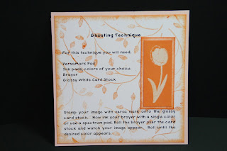
Here's a fun technique that doesn't take long to do yet has an interesting effect! I just LOVE working with glossy card stock and this technique lets me do just that!!!!

Stamp your image with versa mark onto the glossy card stock. Now ink your brayer with a single color or use a spectrum pad. Roll the brayer over the card stock and watch your image appear. Roll until the desired color appears.

You can use this technique for both a background effect or a focal part of your card.

Thank you SO much for visiting today,
Wanda

Monday, September 22, 2008

A Pencil or Two!!

Here's a fun Hallween gift for the kiddies!!! These are SO easy to make too. I LOVE making these kinds of boxes. Acetate is a fun medium to work with.

What's great about these boxes is that you can follow the patterns for any occasion the pencils you find are printed in.

I had gotten my pencils at Wal-Mart for $1.00 and I also saw the exact same ones at the Dollar Tree. There's 12 in a package. Here I used 6 pencils per gift/holder.

To make these pencil boxes you need a few things first. Some pencils, decorative paper and a sheet of acetate.

Cut your acetate 7-1/2" long by 3-5/8" wide. Score on the short side at 5/8", 1-1/2", 2-1/8" and 3". I use the Stampin' Up! Stick Strip to adhere the sides together. Regular double-sided tape will hold but not for long!!

For the cap cut your card stock 1-15/16" by 9/16". Score a half inch all around. Fold the scores in and clip a half inch in on one score on each side. I clip the right score and then turn the paper and clip the right side on that edge, etc. You want all the clips to be the same so when you fold it together they go inside the cap.

I actually taped the caps on to the holder.

Decorate them as you like. I added some grosgrain ribbons and I stamped the bat and punched it out with the oval punch. I added a layer behind it using decorative paper. Simple but yet cute!!

These would be great for Pixie Sticks and other candies though I do NOT recommend you put candy in it that isn't pre-wrapped. This acetate does not state that is ok to use with food items. It's not manufactured for that purpose that is why I don't recommend it.

Thanks SO much for stopping by today,
Wanda

Sunday, September 21, 2008

Make it Quicker!!

Every now and then I want to make a card that is very simple to do. I am aware that not everyone who stops by here is a professional card maker!! And what would it take to be one??? I don't know, I'm certainly not one!!! But I do know that not everyone liked lots of layers, knows or wants to do some of the techniques. SO I like to make cards that don't take a lot of time or effort to do. And personally, I like to find these myself now and then. It's a nice break from lots of layers or cards that take lots of time.

This card didn't take much time at all. I would have to say the cutting of the card stock took the most time here. I kept the colors simple and you know, you can't go wrong with red, black and white now can you???

I wanted to use this dear friend image. I've looked at it MANY times in the set and moved on to something else but every time I saw it I knew that someday I would be using it. Well, today is that someday!!!!

I stamped the image with black Staz-on. I like how it makes the image very bold. Yes it is more difficult to remove from your stamp but it's SO worth it.

I ran my white and black card stock through a Cuttlebug folder, the paisley one and I cut them to fit the card layout.

I was thrilled because I got to use the new striped ribbon too!!! I bought this ribbon with Christmas in mind and it's nice when I can use it for other things as well!!

SO if you're looking for a quick and simple card to do, this is the one. It's the perfect layout for that.

Thank you SO much for dropping by,
Wanda

Saturday, September 20, 2008

Cool "Crystal" Frankie

And yet another use for those Crystal Light containers. For this project I used the tall container, only because that was what I had on hand.

To measure for fitting around you just take your card stock and line it up on the container and roll the paper around. I kept my paper at 8-1/2" and that way I only had to measure for one side. It makes things a bit easier when you can do that.

I did tape the pieces on using the Stampin' Up! Sticky Strip tape. Well, I didn't for the eyes and they did start to come apart so I had to redo them and use the Sticky Strip. That stuff REALLY holds well!!!

I did paint the lid black with acrylic paints. I used a pop dot and stuck the lid right to the top of my paint bottle so I could paint it all at one time without having to hold on to it. And it did require two coats.

I took my Coluzzle and cut out a black circle to fit on the lid. I wanted the top of the lid to look darker and smoother and card stock was the only thing that would work. It doesn't fit the area exactly but it's close, VERY close.

Thank you for spending your time with me!
Wanda

Friday, September 19, 2008

Halloween Card Make N Take

Here is the card I made for my stampers as a Make N Take. I thought it would be fun for them to make a Halloween card. I was having difficulty finding some nice orange colors to go with the Elegant Eggplant and upon looking in my HUGE stash of decorative papers I ran across some I had. It's great to use them up and I think they are still just adorable papers.

I used the new Stampin' Up! set "Halloween Frights." I thought the pumpkin was so cute. And using this card layout allowed me to use a smaller stamp with the decorative papers. I really like this layout, it's fun and if you want a quick and fairly simple card that doesn't look so simple this is the way to go!

The little bat is an eyelet that I had gotten a long time ago at a local shop that has since closed.

It's a fun card and the ladies enjoyed making one!

Thank you SO much for stopping by,
Wanda

Official Postage Info on the Technique Pages

I went to the post office today with two boxes to be weighed. Both had the 20 technique pages in and the other had the pages with the 10 sleeves (2 pages per sleeve). I had them weigh both boxes and tell me what shipping would be for the USA and for Canada.

For the USA it's $4.55 for 6 day Parcel post (with or without sleeves) or $4.80 for 2 day Priority Mail (with or without sleeves).

For Canada it's $3.81 without sleeves and $4.76 with sleeves.

Interesting on the differences in prices. But I had them officially weighed.

I have a couple of sets left if anyone is interested in purchasing them. It's $18 for the 20 pages and add $3.50 for the 10 sleeves. Two pages per sleeve. The pages are 6" x 6" finished. If you are interested or have any questions, please email me here.

Thank you,
Wanda

Thursday, September 18, 2008

Spotlighting Technique Page

Here's a fun technique that has been around a while. Actually most of the pages of techniques I've done have been around for a while. But to make an album you have to include them all. Plus there are new people venturing into the stamping world who do not know some of these techniques.

I like this one because it gives a card some dimension. And it's a pretty simple technique to do.

To do this technique you will cut your card stock to the size you need. Stamp the image on it and then stamp the image again on another piece of card stock. Color in the second one. Take your smaller circle punch and punch out the colored area you wish to spotlight. Now punch a piece of card stock for the layer. Tape them together. Line up the layered piece on the uncolored piece and tape in place. Finish off as you wish. See, that wasn't so hard at all, was it?? You can have a LOT of fun with this technique!

Thank you SO much for stopping by,
Wanda

Technique Pages for Sale

As I had promised I have the technique pages ready to sell. Well, they were ready but I wasn't. I needed to make sure I had time to go to the post office and next week is looking pretty good for me!

I am asking $18.00 (plus tax for Minnesotians) and shipping fees. And if you want them in sleeves it's an extra $3.50. Shipping is based on the weight of the box, your zip code and my zip code (55434). You can go to www.usps.com and fill in the information to know how much postage will be before you decide to buy. I accept charge cards through PayPal and I'll accept money orders. Sorry, no personal checks. The box without sleeves is 8 ounces and with sleeves is 10 ounces.

I 6 sets of these pages left so it's going to be on a first come first serve basis. If you have any questions please email me. Here is the link to the first 20 techniques I posted last month, in case you wanted to see them. You can also view most of them in the slide show on the right side bar. There's only 6 sets for sale so no fighting!! LOL

In a few minutes I will be posting another technique page that is in the second set of 20. I am making extra of those too to sell when I have finished the 20th page so you may want to stay tuned for that!!!

Thank you SO much,
Wanda

Wednesday, September 17, 2008

Wednesday Sketch Challenge at SplitCoastStampers

I have SO many things I'm making here lately and none of them are finished. But yet I put everything aside so I can play with the Sketch Challenge today at SplitCoastStampers. I hate to miss the challenge every Wednesday. I began these when the challenge numbers were around 125 and now it's up to #194!! I did miss a few in there now and then but not too many. I just LOVE playing with new layouts.

This layout allows you to use up little pieces of decorative papers that you may have laying around. Though I do have to admit, my paper wasn't scraps laying around. It was full size sheets that I had bought at Michael's last year. So part if it is accurate, it was laying around, just not in little pieces!!!

So here's my submission to the SplitCoast gallery today!! I have not had a chance yet to go see what the others have done with this layout. I'll check it out later tonight. I'm anxious to see their cards!!

I wanted SO bad to add "stuff" to this card. It just seems odd to NOT add any ribbon or brads or buttons or glitter. But my dear friend Peggy said it looked just fine without anything else. So I decided to just submit it as it is.

If you have the time go play with the sketches on SplitCoast. They are SO much fun and it's always great to have a variety of layouts for your cards. This is how I found the layout for my Christmas card last year. I'm still on the hunt for my layout for this years card. Well, first I have to decide what stamp I'm going to use for our card this year and then I will deal with the layout. But I'll be sure to show you here!!

Thank you every so much for stopping in today,
Wanda

Tuesday, September 16, 2008

Frosted Flakes

I bet you thought I was going to talk about cereal!!! LOL I haven't had Frosted Flakes in years!!! Well, not the cereal kind that is!!

This type of "frosted flake" is made using a piece of white Fun Foam, some white card stock, a bit of glue, a scrap piece of acetate, a snowflake die and some micro beads.

First you take the Fun Foam and cut out your snowflake. Then you cut out two more snowflakes from white card stock. Set your snowflake down on your work surface. Set a piece of acetate on top of it and mark the area you want to put the micro beads. For this one pictured here I put the beads in the middle so I cut the acetate to fit in the middle.

Once the acetate is cut (cut two) take a tooth pick and dip it in the glue and "draw" thin lines of glue on the foam. Affix the acetate. Now glue on one of the white snowflakes. You may need to line up the snowflake first to make sure it fits properly. Glue it in place just like you did with the acetate.

Turn the piece over. Add some beads inside the holes of the snowflake where the acetate is. Make sure there are no beads sitting on top of the foam. Now glue on the other piece of acetate and then glue on the white card stock.

You can sponge the edges with a light blue or add some Dazzling Diamonds for a bit of sparkle. Use them in garland or on packages. There is an endless limit to what you can do with these little gems!! I took the photo before the glue was dry but once it dries it will not show.

Thank you SO much for stopping by today,
Wanda

Monday, September 15, 2008

Things Are Not Always What They Appear to Be!

Now I do have to admit, this little guy is SO cute. I saw these floating around the Internet last year and again this year. I didn't have any time to play with it last year so I tucked the idea away in hopes that I would have time next year. Well, it's "next year" and I found some time so I gathered my supplies and off I went to create.

As I looked at the samples I've seen last year and this year I thought I would change it up just a bit. I thought it would be fun to use the design with a milk carton. Here is the link to the PDF file for the milk carton you can just print directly onto your card stock.

After I printed the carton I cut where it needed to be cut and scored where it needed to be scored. Please note, dotted lines are for scoring and solid are for cutting, except at the top, there's a couple of small lines, DON'T cut them.

I traced the pattern onto some black card stock for the hair. I didn't know any other way to do it. I did print it out but the ink on black card stock just didn't work. SO as I was scoring the Olive Green I scored the black under it. Then I cut the green off at the score before the carton folds at the top. I cut the black off in the other direction, leaving enough black hanging for the hair.

I assembled the green part. Then I cut the hair and assembled that part around the green piece. I used a clip at the top to hold the carton shut while the glue dried. I used Aleen's Tacky Glue. I cut the eyes using a 1" and 1/2" punch. The eye lids are 1" circles cut in half and so is the nose. Sponge around them to give them some depth.

I used a black fine point Sharpie marker for the stitches and the mouth. And I used a white gel pen for the eyes. I didn't seal mine up entirely. I want to pour some candies in there before I do that.

Isn't it just adorable. I was glad I was able to make one of these this year!! I hope you can find some time to make one too!

Thanks SO much for visiting,
Wanda

Blog Candy Winner!!

It's time to announce the winner of the "Chatty Cathy" blog candy.

It's interesting to see all the other hobbies we have. It's what keeps life interesting. There's always something to do and hobbies are a nice escape!!

SO the luck winner can escape into some wedding or shower cards with this set. And that lucky winner is:

reeree62 said...
I love to quilt, scrapbook, and read. This set is so cute!

Please email me with your snail mail address and I will get your package out in the mail to you.

Thank you all for leaving a comment and playing a long. I will have more blog candy coming up soon.

Have a Stampin' FUN day!
Wanda

Sunday, September 14, 2008

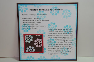
Tinted Opaque Technique Page

Here's a technique I'd never heard of before. I was on SplitCoastStampers last night and I saw this technique page done by user name reccabecca. It looked simple enough to figure out and the instructions were in focus enough to read. I read the instructions and then headed to my workroom to play it from memory and this is what I came up with!

Stamp your image on the dark colored card stock with white craft ink or Versa Mark. Cover with white embossing powder and heat it. The embossing powder will not be totally smooth. It will have dimples in it exposing the card stock. This is what you want. Color on the image areas with desired colors of markers (NOT permanent markers). Wipe off color on embossing, it will bead up. Heat set color, if color fades reapply color and reheat.

I like to emboss and I LOVE to sit down and just color so this technique brought to me two of the things I enjoy when stamping. I think this would make a very fun background and also cut up in pieces for layering!!! There's LOTS you can do with this technique!

This one goes in the new set of 20 technique pages and one set will be offered here as blog candy when the pack of 20 is finished. I believe this one is #4 out of 20. But it won't take long to get to 20 so hang in there!

To check out my other technique pages just click here.

Thank you SO much for stopping by today,
Wanda

Saturday, September 13, 2008

It's SO clear! Weekend Project!

I was playing around with the Sizzix Pillow Box die. Card stock seems to be the best medium, it's firm enough to work with. Decorative paper is fun because of the colors but it's a bit flimsy. The doublesided works better for that. And acetate, well it needs a bit of help. It didn't leave the fold lines deep enough. SO I tried it again with a piece of card stock on top and it was much better. I also tried it with a piece of chipboard under the die and it worked even better. Will this wear down the rubber on the die? I don't know. Will it cause the die not to cut card stock as well? I don't know. I guess if I keep cutting acetate this way I will find out, won't I? SO with those concerns aside I will show you what I did with the acetate.

First you want to crease all seams. This is something you don't want to do once you got the tape on. Nothing like fighting with acetate that is sticky!!!

I used the Sticky Strip tape by Stampin' Up! to tape the seam shut. Regular double-sided tape will work but not for very long!!! I laid the tape on close to the inside edge. Then I folded up one end and added the candy. I tucked in the other end and tied it with the ribbon.

Then I cut a piece of stamped card stock and wrapped it around the pillow. I added the cat on a scalloped layer. These are VERY easy to make and a lot of fun. Can you imagine how fun they are going to be to give away???

These would make great Halloween gifts, Hostess gifts, Customer Appreciation gifts, Make n Takes and I think they would be a fun thing to have at a Craft Fair or Stamp Camp!

Thank you SO much for stopping by today,
Wanda

Friday, September 12, 2008

It's Blog Candy Time!

Yup, it's that time again. I know I was suppose to be writing up a post when I was ready to sell the extra Technique Book pages I made in the round 1 of 20 pages. I will do that next week. I know some of you are sitting on pins and needles waiting for that post to go out. Check back next week, I promise I will have it on there then. But today I'm posting my "Chatty Cathy" Blog Candy. I've had 900 posts since the blog was started. Shocker, huh?? LOL

To celebrate the 900 posts I'm offering this "Wedding Bliss" clear stamp set by Scraptrends. This is one of those sets that you cut off the header and the pouch goes in some type of binder or notebook. Nice way to keep your clear stamps organized!!! And what a cool way to store them!

This set is new, unused. It's still sealed with that little plastic "thingy" near the zipper and until it is cut off you can't open it. I took a photo of the back because it showed the designs better. It looks like a fun wedding/bridal shower set. I think the towels hanging are adorable!!!

What do you need to do to be entered in the random drawing for this fun blog candy??? Well, tradition tells that you must answer a question! Ok, the question of the day . . . . Other than stamping what other hobby do you have/do? For me, when I am not stamping you can find me either playing with beads or polymer clay and sometimes even playing with polymer clay beads!!! LOL

Please leave your comment to this post only and on Monday September 15th I will use the random generator to pick a winner. Please do NOT leave your email address in your comment. Spammers LOVE that and I don't contact anyone via email. I post the winner on my blog.

Thanks for playing and good luck to you,
Wanda

Thursday, September 11, 2008

Lip Balm Gift! Weekend Project

I had never made my own lip balm before. I was at Sara's blog Sara's Creative Adventures earlier this week and saw her post and a recipe for it so when I was at Joann's I thought I'd use some of my coupons on a package or two of pot jars. They weren't on sale so I was able to use my coupon!! It was a good day!!! LOL Thanks Sara for enabling me!!! LOL

This morning I found some time to make the lip balm. You can check out the recipe on Sara's blog. It was easy enough to do though I did make sure I had the fire extinguisher at hand. Somehow heating up petroleum jelly made me think of flames. SO I thought I should at least be prepared!!

After I got the lip balm in the pot jars and my mess cleaned up. I ALWAYS make a mess when I do things! Never fails!!! LOL

Sara also has a link to the little box she put her lip balm in. My lip balm containers were smaller than hers so I had to design my own box.

SO if you are using the lip balm pot containers from Joann's and you want to put them in a little box, you will want these measurements. For the bottom part of the box I cut my piece of white card stock 4" x 4" and I scored it all the way around at 1-1/2". For the lid I used decorative paper and I cut it at 2-1/2" x 2-1/2" and I scored it at 1/2" all the way around. I held the paper to be scored at the 2" mark and scored that way. It was too hard to hold the piece so I only scored a half inch. If that makes sense. What I'm trying to say is that it was too hard to put the paper in to be scored at 1/2" so I put it in at 2" and the part hanging over is 1/2" and I scored there. It's the same difference just easier to hold on to! For both top and bottom you will snip one score line on each side. Tape the sides together. I suggest you put it together first so you can see which pieces need to be taped or glued. Before I taped the lid I punched a hole in it and added a piece of acetate for a window. The best way to make sure it's centred is to punch a piece of copier paper first and use that as your pattern. That way you have a better shot at getting it straighter!

I put the lip balm in the box and I tied a red grossgrain ribbon around it. I REALLY wanted to show that it was strawberry but the box was too little to decorate with strawberries so I came up with another container for it. I thought I would play with the new Sizzix die cut and made this little basket. Actually I made 3 of them. I kept gluing them together before I stamped them. UGH!!! Two times, can you believe it?? LOL

I glued the basket all up AFTER stamping on it. I wanted to add some crimps to the inside but I couldn't find any so I had to wad up a bit of tissue paper. It worked. I added the little box and tied it shut with more red ribbon.

It was a fun project. These would be great Stamp Cramp items, fun Hostess or Customer Appreciation gifts. As far as a Make n Take, I think they take a lot of time, even if you provided the lip balm already made. I think these would be great for Craft Fairs too!!

Be sure to check out Sara's blog for the recipe!!

Thanks SO much for stopping by,
Wanda

Wednesday, September 10, 2008

Wednesday Sketch Challenge at SplitCoastStampers

WOW, this Wednesday just snuck up on me. I'm on my computer and there is that little noise that lets you know you got a new email. I look and it's the Sketch Challenge from SplitCoastStampers. Of course I had to go look and print out the layout. But I was just too tired to work on it. SO this morning I decided I would play first and then do my work. But sometimes when I do that the work never gets done!!! Once I get in the stamping mode, well it's just best not to talk about it!! LOL

Today's sketch at SplitCoast was a very fun one. LOTS of pieces to it. For me those are quite a challenge. I have this tote of stamps from various companies and I could see this snowman through the plastic and I knew this was the one I wanted to use for the sketch. Then it was just a matter of adding the background.

Well, you can't have a snowman without snowflakes now can you??? SO I used the snowflake Cuddlebug folder and did my white background with that. I was struggling a bit with the Brocade Blue piece. I was going to use some decorative paper there but I was having trouble matching the color so I decided I would just run that through the Cuddlebug too and it did the trick!!!

I added ribbons on a black layer for the 3 strips under the main image but I felt they needed something more. I found some snowflake buttons and set them in place but they were too white so I sponged on a little blue Staz-On and they stood out better. I added a white button in the top left corner of the main image. It just needed a little something up there too. And the bottom snowflake was an option "thing" on the sketch. I had attached it with Crystal Effects and after I had it on there and had the picture taken I thought I should have sponged the edges with blue Staz-On. Not much I can do about it now. But if I make another one I'll remember to do that!!! Me remember, that is SO funny!!! LOL

So here you have it, my card for the sketch challenge! If you have the time I highly recommend you give it a try. It's always fun to learn and try new layouts. That is how I found a layout for my Christmas cards last year. This year the layout will be simpler so it won't cost me the extra 17 cents to mail them out!!!

Thank you SO much for stopping by today,
Wanda

Tuesday, September 09, 2008

Rolling Marbles Technique Page

I thought it was time for another technique page. It's been a week since I've posted one. Can you believe that??? LOL

Many of these techniques are being done by me for the very first time. I've heard of many of them and even seen a lot of them done but not many of them have been done personaly by me, until now! I like to write up the instructions as clear and simply as possible.

This technique is very easy to do and is a lot of fun too! There is a lot of background themes you can use with this technique. Halloween comes to mind here with the purples and oranges!!

Place your marbles in the container. Add 3 or 4 drops of desired colors of ink in the bottom of the container. Roll the marbles back and forth several times. Attach the card stock to the inside of the lid with temporary mono. Close the lid. Turn it over so the marbles will be on the card stock. Roll the marbles around and the colors will be on the card stock. SO fun and pretty!

Thank you SO much for stopping by today,
Wanda

Monday, September 08, 2008

You Can Do It, I KNOW You Can!! Step by Step Tutorial

A couple of comments were left on my "Wintery Sky" post yesterday, a couple of wishes!! Wishing they could sponge like that. Well, you can!! It's REALLY not hard at all. I will walk you through it step by step and the next thing you know you will be able to do it too!!

You will need a few things first. A piece of glossy card stock cut 5-1/2" x 4-1/4". For this picture I used Pretty in Pink, Apricot Appeal, Bashful Blue, Brocade Blue and Night of Navy ink pads. You will need a sponge for each of those ink pads. You will also need an image to stamp with Staz-on ink

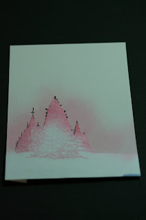
Stamp your image on the glossy card stock. Stamp another image on some scrap copier paper. While the Staz-on is trying cut out the image stamped on the copier paper. You don't need to go around each branch of the trees. Click on the photo and you will be able to see how my masking was done. If you look close at the little tree on the right side you will see LOTS of sky area still exposed. It will be taken care of later. I should have trimmed the copier paper just a bit more. But it's no big deal and is easily fixable.


Now set the mask in place over your image and fold it around the edges of your card stock. You can tape it on the back if you like or just hold it in place as you sponge.


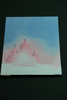
First I took the Pretty in Pink ink and get the sponge inked up. Now just drag the ink on the card stock. You're really not sponging or dabbing like you would do for the edges or on regular white card stock. Just drag the ink up towards the sky. Ink up the sponge again and repeat until you have a "halo" around the image.

Then I took the Bashful Blue and did the same thing but I forgot to take a photo of it. I did sponge a little on the pink. You want to do that so the colors blend together


After the Bashful Blue I took the Brocade Blue and sponged into the Bashful Blue and again pulled the colors up towards the sky. You want to make sure you are not covering all of the Bashful Blue. You want to be able to see each color you add.

And for the final blue I used the Bight of Navy and kept dragging it towards the top of the card. It wasn't as dark as I wanted it to be but it worked.


Then I took the Apricot Appeal and dragged some up into the pink to give it the look of a sun setting in the background. Now to have a truer looking "sunset" you can add the Apricot Appeal to the window of the church when you are done. I used Yo Yo Yellow and it's too "yellow." It didn't give a "true" look of the setting sun shining through the window. But no one left me a comment telling me they noticed it!!! LOL

Remove your mask and you can see the image with the beautiful sky behind it. I know you can do it!! Now it's ready to color. When I did mine I had colored in the church and trees first and then did the sky. Either way works, there is no right or wrong way to do it.

To fix the sky on the right side of the trees and there is other bits of sky showing just take a Q-tip and push it into the ink pad and rub the color in.

Now would be a good time to add some white crayon on the branches of the trees if you want the snow to show. I did it but it was after I had begun coloring the tree in so it didn't work. But now I have a second image ready to color in!!!

Ok now it's your turn!! And I KNOW you can do it!!

Thank you SO much for stopping by,
Wanda

Sunday, September 07, 2008

Wintry Sky

Today I thought I would play with one of the newer sets in the Stampin' Up! 2008 Fall-Winter Idea Book & Catalog. This set is called "A Wish for Peace." It also includes a word stamp and a dove. I LOVED the church and trees!!!

I stamped the image on glossy card stock using Black Staz-on. Then I used Q-tips to color in the detailed areas. I sponged in the sky beginning with the Apricot Appeal and ending with the Bordering Blue.

I used the "Merry Christmas" word from the "All Holidays" set. I used the Designer Label punch and behind it I layered the new Wide Oval punch. I taped them together and along the edge of the Designer Label piece I poked a hole so I could insert the brads. I did it right along the edge so part of the brad would hang over on top of the label. It gave it more of a bookplate look. I wanted a little bling on the card but not too much. The church and sunset part of the card are meant to be the focal point of the card.

There wasn't a lot to this card. Sometimes I find images like this hard to work with. You usually have two choices here. One you spend some time coloring in the areas or two you stamp the image in one color of ink and accent with colored layers. These types of designs are very easy to work with using a single color to a more elaborate card if you color in the details. It's all in what look you are trying to achieve. I thought it was a fun card. I was in the mood to color today!!

Thank you SO much for stopping by today,
Wanda
Saturday, September 06, 2008

A Birthday Cupcake Quick Card

I needed to make a birthday card and I needed to make it quick. SO nothing makes a card quick than decorative paper. And I added a die cut to the card and it maked an even quicker card. I didn't think it could get any quicker than that but the die cut really "cut a few corners!" To pop a piece of card stock in the Big Shot and out comes all your edges cut perfectly and even some perforation to it, well what more can you ask??

I used the Stampin' Up! "Crazy for Cupcakes" set. I am anxious to play with this set some more and make some not so quick cards. I want to play with Crystal Effects with it and do more shadowing. And there is another adorable stamp in the set that I have some plans for too!!!

But for a quick card this one did the trick. I think it could use a bit more bling but then it wouldn't have been "quick!" SO it is getting sent off as it is!!

I hope you're enjoying the weekend, it's nice and cool here. I think fall is in the air!!!

To view more quick cards click here.

This item was made using Stampin' Up! products. To view more items made using Stampin' Up! products click here.

Thank you SO much for stopping by today,
Wanda

Friday, September 05, 2008

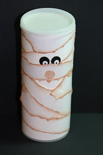
Is That My Mummy???

No, it's suppose to be Sue's mummy!!! She sent out her mailer and I deleted it. But then I figured I could do her little project by memory. I have to laugh at myself there. Memory??? It's fading fast!!! LOL

Fortunately I did read her tutorial on how to make it. There really isn't much to these. You just rip some card stock, sponge the edges and wrap it around the Crystal Light container or you can use a Pringles can. I had just emptied a Crystal Light container out and it hadn't made it to the laundry room yet! I use them in there to put lint in and we use that lint to light our camp fires! No need for anything but a match and the lint!! It burns hot and gets the kindling going!!

Anyway, back to the container. After I got done wrapping I had to patch a few open spots. But hey, no mummy is perfect!!! I used small circle punches for the eyes and nose. Though I'm not too sure Sue's had a nose!!

Isn't he cute??? It was fun and I'm thinking that this would be a pretty easy project for kids to do.

Have fun with this project. I hope I did it justice Sue!!!

Thanks SO much for stopping by today,
Wanda

Thursday, September 04, 2008

Bath Salts Gift Pack Weekend Project!

I haven't done a weekend project in a while so I thought I'd post one tonight. I've been so busy with those technique pages that I forgot about doing a weekend project until I ran across some bath salt I had made a while ago. It keeps as long as it's in an air tight container. And I ALWAYS keep mine in an airtight container. Not because it's best for the bath salts but because I would bump it and spill it!!! LOL

Let's start out with the bath salt recipe. It can be found here. It's a very simple recipe with only a few ingredients. It's best if the bath salts are not "today" fresh. Putting bath salts in plastic is not always a good idea. In time the fragrance oils will eat away at the plastic. I weigh my bath salts and 50 grams fits just right in the 3" x 3" zip bag.

SO to make the container/box you can print right on the card stock. I would use copier paper first to see if the measurements are close enough. Each printer is different. I saved the pattern in a PDF file so anyone can open it (as long as you have the program on your computer that opens these, usually the Adobe Reader). From side to side on the inside part should measure 3-3/16". Your bag of bath salts measures 3" x 3" so if the inside of the box is larger than 3" x 3" it should work. The pattern for this project can be found here.

Decorate the container/box as you wish. Here I used the Stampin' Up! "Sprinkles" little back ground stamps. I thought flowers sounded good on a relaxing bath product! I used glossy card stock and stamped in Versa Mark. I embossed with clear embossing powder. I then sponged in the colors. I used Certainly Celery, Pretty in Pink and Yo Yo Yellow.

Once the container was colored the way I wanted I set it aside to dry. I took a mailing label and put it in my Big Kick using the new Baskets & Blooms die cut. There is a cute little flower on there and the label fit perfectly on it. So I cut out the flower only. I sponged on the color.

Remove the backing from the label and have it ready to go. Lay the bath salts inside the box. Fold over the side flaps then the bottom flap. Holding it securely fold over the top flap. Take the flower label and "tape" the container shut. I wrapped some Certainly Celery ribbon around the box. Not because I wanted it to stay shut, the flower will do just fine on it's own for that, I just wanted to add a bit more color to the container. I punched out a couple of circles to fit in the scallop. For the white circle that reads "Bath Salts" I made that on the computer. I printed out a full sheet of them as I plan to make a lot more of these for gifts and to sell.

I did type up the instructions on copier paper and I taped them to the inside of the container, it also includes the "warning" for children under three, etc.

Here are those instructions:

Sprinkle a desired amount of the bath salts into warm running bath to allow them to disperse. Get in the bath, relax and enjoy. Warning: For external use only, adult supervision required. Not intended for children under 3 years of age.
As with all of the photos on my blog, if you click on them you can view the items closer. Don't look too close though, many of them have imperfections!!!

More weekend projects can be found here.

Thank you SO much for stopping by today,
Wanda

Wednesday, September 03, 2008

Wednesday Sketch Challenge at SplitCoastStampers

Once again I was able to find a few minutes (more than just a few) to play with the new sketch at SplitCoastStampers. It was a pretty simple and fairly basic layout. There was not a lot of challenge to it other than finding a single stamp to fit in the center. Though I did give the "Lovely as a Tree" set a thought and add some other elements to it but I wanted to play with the Ghouls today!!! LOL

Aren't they just adorable??? The "Tableau of Terror" set is by Stampin' Up! The words on the card were not from the set. I just wanted "Happy Halloween" on the card but couldn't find one to fit in the oval punch area so I went on the computer and typed in the words. I didn't have a creepy font so I had to go online to find one. This one was called "bloody." Fits the wording, doesn't it??? It's amazing all the free fonts out there!!

I colored in the characters with colored pencil and sponged the edges. The decorative paper is by K and Company. I had gotten it last year at Michaels. And it's NOT that I was hoarding it, I wasn't. I only used a few sheets from the pack and Halloween was over!! SO I just kept it with the other decorative papers and figured I'd be using it again and here you have it!!! And guess what? There's still a LOT more paper left!!! I did buy one sheet of Halloween paper this year. I HAD to. I was at Archivers (I had to use my coupon!!!) and I walked in the die cut room. I saw this cute box but you couldn't bring in your own paper. You had to purchase paper at the store and then you can cut anything you want using that paper. Well, that box was just TOO cute to pass up so I walked out of that room and found a cute piece of decorative paper and bought it. I went back in that room and cut out the box. It's still in the bag. I have not had time to play with it but I will this weekend!!

Anyway, back to the card. I used my BigKick and a Halloween die cut that I have had for a few years. I cut out a spider and a bat. The card needed something in that left open area and those few elements seemed to do the trick!!

It was a VERY fun card and easy to do. The coloring took the most time.

Thank you SO much for stopping by today,
Wanda

Tuesday, September 02, 2008

Snow in September!!!!

I was playing around with the BigKick and the snowflake die cuts. I LOVE them all. Now I can have snow any time I want it!!! LOL

I tried several mediums and found that I like the Fun Foam the best. Oh and while I stopped in The Dollar Tree this weekend to get "ONE" thing (yeah, right!!!) I saw they had packages of fun foam. And being it is a dollar store they were "only" a dollar. The "only a dollar" kills me every time I see something there I think I "might" be able to alter!!! LOL And I did not buy them all. I only bought 2 packages of it!!!

Ok, back to the snowflakes. Aren't they cute??? You can get the Fun Foam in different thicknesses and you can also get it with a sticky back too. Those are wonderful because it can be a bit touchy getting the snowflakes all glued up before the glue dries!! I thought I would make mine into garland. I need to cut out a few more and add them to the garland, I need it just a bit longer. It didn't take long at all to make.

I punched holes in the ends of the snowflakes so I could add the prongs of the brad in each one. The fun brads came from the "Pretties Kit." They were perfect for the garland!! It added just the right bling. You can also add glitter to the fun foam. I chose not to, I wear enough of that stuff on a weekly basis that I thought I'd take some time off from it.

I have some plans for a few of the other die cuts and I'll be sharing my creations with you in between technique sheets!!! SO much to do!! LOL

Thank you every SO much for stopping by,
Wanda
Monday, September 01, 2008

Faux Seersucker Technique Page

Here is the page I came up with for the "Faux Seersucker" technique.

This is a very simple technique to do. I think it took me longer to color in the flowers than it did to actually do the technique!! LOL

Cut your card stock to 5-1/2" by 4-1/4". Stamp your image on the card stock. Insert the long edge of the card stock in your paper crimper. Now insert the shorter end of the card stock in the crimper.

Repeat both ends once more and you have the look of seersucker fabric. Use it as a background layer for your card or cut up and use as a component. Trim your card stock to fit the area you are working in.

Remember it's important to run the card stock through the crimper a total of at least 4 times or you will only get a re-crimped look. Running it through the crimper again causes the paper to not only get the ripple look but because it crimped over a previous ripple it caused it to buckle a bit and that buckle is what gives it the look of seersucker!

I didn't quite understand how it would look like seersucker until I actually did the technique for myself.

It's fun and SUPER easy to do!! Have fun with this one!!!

Thank you SO much for stopping by,
Wanda