Pin It

Thursday, July 31, 2008

Technique Page Bleaching

I know this is an old technique but to have a book of techniques it needs to be made to be included in it!!

You want a darker colored card stock to do this technique. Fold your paper towels to fit in the glass dish. Set the paper towels in the glass dish and carefully pour the bleach on it to soak them. You do not want them to be too dry but you don't want them to be sopping either. You will be using the paper towels as your "ink" pad. Put your stamp on the paper towel "pad" as you would an ink pad. Stamp the image on your dark colored card stock. As the bleach dries the image will show up in a different color. You may want to do this in a well ventilated area due to the smell of the bleach.

It's a pretty simple technique and you can have a lot of fun with it. It's very interesting to see what colors the bleach brings out in different colors of card stock. You may want to click on the photo to see the bleaching closer. It didn't photograph well.

I have trouble working with bleach because I have a cat that LOVES it for some odd reason. We think she may have been a bleach blond in another life!!! LOL I have Holly Tex brand carpet in my workroom and there is a list of steps of cleaners that you use to get up spots and the last item on the list is bleach water (half and half). This carpet was designed to accept the bleach mixture without ruining the carpet. Well, there had been a couple of times I had to use it and that cat would rub on the carpet with her face. I have to put a laundry basket on the area and put something on top of it so she doesn't get into that area. I just don't know what is up with that cat. And if I get it on my hands, even after washing them she still smells it. And then she's constantly rubbing her face in my hands. Silly, silly cat!!! Today I was able to do this technique without her being near me. Lucky me!!!

You can use this technique to create some fun backgrounds!!

This item was made entirely of Stampin' Up! products. To view more items made entirely of Stampin' Up! products click here.

To see the other Technique Pages, click here. You can also watch them on the slide show on the right sidebar, just scroll down a bit. But if you want to see them faster just click on the link above to take you to all of them!

Thank you SO much for stopping by,
Wanda

Wednesday, July 30, 2008

Wednesday Sketch Challenge at SplitCoastStampers

It seems that each week the Sketch Challenges (SC) at SplitCoastStampers are more fun than the last week. Though I am not all that fond of the card I did I submitted it anyway in hopes that I would find some time to make another one.

I don't care for the background in the apricot color. I should have done it in a soft blue. I did get to play with my airbrush. I don't get to use it very often and when I do I really do enjoy it.

I used it on the coat, hat and background. The rest was done using markers and a blender pen.

I had run across some decorative paper I had bought last year and never used it. Imagine that!!! LOL And no, I didn't run across it cleaning! I wish! I was looking for something I had misplaced, if you can believe that!!! LOL When I saw the sketch challenge I thought of that paper. I was a bit reluctant to do a snowman in the summer but as cold as my workroom is I could only think of winter!!! My workroom gets unbelievable cold. But I'd rather have it that way than hot. I HATE the heat.

Anyway, I also was able to play with one of the new word sets that will be in the new catalog. It's called "Heard from the Heart." I thought it was a sweet set and I LOVE the looks of the larger words. And I thought it was versatile too. I can take a marker and use only the large words if I want or just ink up the whole thing and use it all.

The snow angel stamp is by Inky Antics. They have some really sweet snowmen. And you know me and snowmen!!!

If I find time to do another sketch I will post it here when I finish it. Hopefully it will be one I will like better than this one!

If you have time I highly recommend you stop by SplitCoastStampers and try the Sketch Challenge. They are a lot of fun and what is REALLY fun is to see all the different takes on that sketch. On the Sketch Challenge page is a link to the gallery submissions which contain only the ones from this sketch. You get to see how creative people are with the same layout!!! It's very impressive!

Thank you SO much for stopping by,
Wanda

Tuesday, July 29, 2008

Cute Purse Casing!

I was over at Sara's blog, "Sara's Creative Adventures" and I saw this adorable purse card she made for a 30/30 Challenge. The challenge was to not buy any new stamping stuff for 30 days (I'd die!!! LOL) and to make something each day for 30 days. Now that is something I could do and not die!!! LOL

My card is a case of Sara's and hers was a case from someone else. You can visit her blog for more information on this card and on the 30/30 challenge. I didn't participate in it because I knew I couldn't do the not buying anything new for 30 days.

I just thought this card was SO cute. It's done with punches!! Well, except for the squares behind the purses. The instructions called for the Stampin' Up! square punches but they were too small for the label punch that made the purse so I just cut them on the paper cutter. The black squares measured 1-5/8" x 1-5/8" and the colored squares measure 1-7/8" x 1-7/8" each. I REALLY should read Sara's instructions better and I wouldn't have had to cut the CS, except for the outside layer. But for those of you who don't have the square punches you know that you can use the paper cutter instead!

This was a VERY fun card to make and it really didn't take much time at all. There was just a little bit of stamping. I used the Stampin' Up! "Boho Backgrounds" set on the purse part. The colors I used were Barely Banana, Almost Amethyst, Pretty in Pink and Bashful Blue. I used the same colors of ink on each of the purses. I didn't have any decorative paper to match each purse so I just used stamped card stock and it turned out just fine.

I am going to send this to a friend of mine later in the week. She LOVED Red Lobster and last week I received a gift card in the mail for $10 off a $20 order there if you use your Discover card. I received it because Discover sent out brand new cards with new charge account numbers on it. I know it's for safety reasons but I HATE it because now I have to contact those places that we have bills paid directly to our charge card. It's such an inconvenience. They do this to us now and then and I think it's because of the time $600 was sent to Nigeria via Western Union in Missouri of all places. I was contacted by Discover to see if I had made that transaction. Nigeria??? I don't know anyone in Nigeria and personally I'd actually have to go online to even find a Western Union store/shop/bank whatever they are in my area. SO they took care of it and cancelled our charge cards and issued us new ones. And then began the process of finding those places that take their payment out monthly on our charge card and letting them know the new information. Such a pain.

Anyway back to the card. I think my friend will like it! What's not to like about it??? It's such a fun card!! I won't tell her how easy it was to make though!! LOL

Thanks Sara for posting this so I would be tempted to case it!!! You do great work and your blog is a LOT of fun!!!

Thank you all SO much for stopping by,
Wanda

I Received an Award!!!


I received an award from Sandie at Bear Patch Crafts. Sandie has some REALLY cute crafty things on her blog. For those of you looking for 3-D items to make for gifts you should be able to find something on her blog.


I thank you for the award Sandie but I'm sorry to say I am unable to play at this time.

Monday, July 28, 2008

Unbelievable!!!

I can not even begin to tell you all that went wrong while making this card!!!

Imagine if you will a white card, just a half a sheet of card stock folded in half. And at the bottom right corner was the flower pictured on this card. It was in the apricot oval. Just sitting there in the lower right corner. Nothing more on the card. I just wanted to make a very simple "thank you" card. On the inside I was going to use the little "thanks" from the Stampin' Up! set "Everyday Flexible Phrases." That was all I wanted. Something just simple and the "thanks" on the inside would say it all. But it turned out SO ugly I couldn't even take a picture of it. SO I cut the flower off the corner and layered it with the decorative papers and card stock.

Then I made a larger layer that went the long way on the card. It was about 3/4" from the top and bottom. I set the flower layer on top and it looked awful. SO long and out of place. So I cut it down. Well, in doing that the proportion wasn't right for the flower layer. I ended up cutting another layer the same size as the flower one and going that route. Oh but I forgot to tell you. Before I had the long layers on and the flower just sitting there on top I had stamped "thanks" on white and punched it out. Then I punched out a larger circle using the decorative paper. And I layered those on top of a piece of Regal Rose I had used the scallop punch on. UGH!!! And then I had the audacity to try to get the scalloped layer to work with these two layers you see on the card. Another BIG UGH!!! LOL

I decided to tie on some ribbon and add the words directly onto the decorative paper and I was much happier with how this turned out. The behind the scenes stuff gets to be pretty intense sometimes and in the photo it looks like it was just simple and sweet!!!! Pictures can be deceiving!!! LOL

This item was made entirely of Stampin' Up! products. To view more items made entirely of Stampin' Up! products click here.

Thank you SO much for stopping by,
Wanda

Sunday, July 27, 2008

Taking Advantage!

Isn't it fun when you can take something so plain and dress it up to be so cute you don't want to use it?? LOL

This is the time of the year when you can find some REALLY great bargains on school supplies!!! And I mean REALLY great deals. These little composition notebooks are always so expensive but at this time of the year you can get them for a song and a dance. Well, not really. I got kicked out of Wal-mart for the "song and dance" thing and I'm not allowed back!!! And if you heard me sing or saw me dance you'd understand!!! LOL

I have to tell you a little story about what happened to me on Mother's Day this year. We were at Perkins for dinner and "Blueberry Hill" was playing on their sound system. I started singing along and DH asks me "who sings that song?" I told him, "Fats Domino." And he says to me, "Let's keep it that way!" LOL There's a music critic in every family, isn't there? LOL

Ok, back to this fun composition book. I thought it would be fun to dress them up a bit. It's nice to have them decorated a bit so they would never get mixed up with someone elses. This would be a great project for the kids to do on their notebooks. It personalizes them plus gives them some fun things to do with their notebooks. I was going to add some buttons or buckles and ribbons to this but realized I was going to be putting mine in my purse and those fun embellishments wouldn't stay on there for long. And they'd probably get caught on something else in my purse. Certainly not money!!! Never any of that in there anymore!!! LOL

To cover these notebooks you just put your card stock over the notebook and take a pencil and make light marks where you need to do your cutting. It's very rare to find the font and back of the notebook to be equal because of the way the spine piece is put on. So you will need to cut the front and back out separately. And again for the spine piece you'll just lay a piece of card stock over the black, add a little more and mark where the folds go. I used the bone folder to make a nice sharp fold. And do the same for the back part of the spine.

Decorate your notebooks as you like. Keep in mind where these are going to used before you load them up with embellishments!!! It's probably best to keep them simple.

I used the "notes" stamp I had from Vista Print. You can order your own custom stamp from them or Stampin' Up! and have your notebooks say what you want. I'm wondering if I had one made by Stampin' Up! then it would never retire now would it????? Hmmmm, there's a thought I'm going to have to pursue!!!!! Then I can use it on any notebooks I make and it would still be all Stampin' Up! products!!! Ok, guess what I'm ordering??? LOL

Ok, now when you pick up those notebooks for the kiddies help them decorate them up for school!! Or dress them up yourself and suprise them on the first day of school!

Click here to view my other notebooks for more ideas!

Thank you SO much for stopping by,
Wanda


Saturday, July 26, 2008

Leave it to Leah!!!

Leah is a very good friend and a FABULOUS and very CREATIVE stamper!!! She is extremely talented, especially with those Peppermint Patties!!!! It's amazing what she can come up with!

Leah made these wonderful cards that I just had to share with you. I am just lovin' the sports one!!! Not that the baby one isn't great too but I'm SO impressed with the sports one because I rarely do any sports cards. I was drawn to the brightness of the card too. Isn't it just wonderful? She used a decorative shank button on the bow. It was just SO perfect for that card too!! Probably why she used it, huh?? It was SO nice of her to share her cards with me and to allow me to share them with you.

I have never thought of using those buttons on cards before. Thank you Leah for the new ideas and for inspiring me. Next time I'm out shopping I'm going to be looking at those decorative buttons a little differently. They're not just for clothes anymore!!!

Leah also used those buttons in her scrapbooking. She said she removes the shank on the back so they lay a little fatter on the pages. Another GREAT idea!!! I told you she was "CREATIVE" now didn't I???
Here is another great idea that Leah had earlier this year. These graduation candies are SO cute. And they were a BIG hit at the party too!

Oh and if Leah's hubby is reading this, Leah REALLY wants a "Sizzix Big Kick" for Christmas!!!

Thanks SO much for stopping by,
Wanda

Friday, July 25, 2008

Fossil Stone Technique Page

Here's a REALLY cool technique. I just love the effect of this one. And the colors you can mix together make it even more fun.

Rub one of the colors on the inside of the front of the plastic folder. Repeat with the second color on the inside of the back of the plastic folder.

Put the plastic folder together and rub so that the two inks mix and bubbles form. You may want to have a piece of paper over the plastic so you don’t get ink all over your hands. You want the ink to be all over the entire plastic pieces.

Put two pieces of Glossy White Card Stock together, glossy side out. Insert in the plastic folder and then rub so the ink transfers to the card stock.

You can use it as your background and you can stamp directly on top of it too. SO much you can do with this background. And it's perfect for a masculine card!!!

This one is going in my technique book and I have one ready to go with the other pages that I will be giving away as Blog Candy when my blog reaches 500,000 hits. That should be within 30 days. And with that in mind I'd better get cracking on making some more pages. A month will fly by fast. Plus a page a week won't add up to much so I need to do two or three and that should make a very nice resource book for someone!!! The book pages will go to a lucky winner in a random drawing. When I put out the word on the Blog Candy you will just post a comment there and the names from that post will be drawn. Plus I will be adding some more names too. You may have an extra chance to win. I will pick a day from now until the post of the Blog Candy, a day that has the most comments. I will take those names and add them to the drawing. SO if you left a comment on a day that has the most comments your name will be in the drawing twice!!! SO much fun!!

This item was made entirely of Stampin' Up! products. To view more items made entirely of Stampin' Up! products click here.

To see the other Technique Pages, click here. You can also watch them on the slide show on the right sidebar. But if you want to see them faster just click on the link above to take you to all of them!

Thanks SO much for stopping by,
Wanda

Thursday, July 24, 2008

So, I'm At The Dollar Spot In JoAnns...... Weekend Project

Need I say any more????? LOL I wish I could just walk right past that area but no, I just have to "look to see if there is anything new." Well of course there is, there's always something new there. Today it was strawberry stuff. The paper note cube is what caught my eye. And the Stampin' Up! "Tart & Tangy" set came to mind. And I knew I had some decorative papers left too. SO I got them out and my Crop-A-Dile and started to play.

Now this project didn't take long at all. I counted 30 sheet of the strawberry paper and removed them all at once so they would still be stuck together. Then I cut a piece of white cardboard that was in the package of decorative paper. I made it the exact size of the note paper. Then I cut a piece of the red decorative paper the exact same size too. I took a piece of white card stock and used the corner rounder and made my scallop. Now for those of you who pre-ordered the new scallop edge punch this will go much faster for you. I'm waiting to order mine, just didn't have the funds!

I taped the scalloped piece in place with a little bit of tape. I didn't put the tape where I was going to be punching. I didn't want my punch to get all sticky in the holes. It's REALLY hard to clean out. Using alcohol soaked q-tips wasn't on my list of things to do tonight!!! I marked where I wanted the holes to go and punched them with the Crop-A-Dile. Then I took some red grossgrain ribbon and fed it through the holes and tied the bow.

I took the strawberry from the "Tart & Tangy" set and used the Real Red marker on the strawberry and Garden Green on the top of the strawberry. I huffed on it and stamped the image on a piece of white card stock. Then I punched it out with the 1-1/4" punch. I punched out a red circle using the 1-3/8" punch and I used the scallop punch on the Garden Green card stock. I taped them all together and taped it on the cover. Just too quick and very simple. If you want a thicker pad just add more paper but you'll have to punch it separately, the Crop-A-Dile can only punch so many sheets at a time!

These would be a fun Make N' Take, Hostess Gift, Customer Appreciation Gift, Stamp Camp item or even for a Craft Fair.

This item was made entirely of Stampin' Up! products. To view more items made entirely of Stampin' Up! products click here

Thank you SO much for stopping by,
Wanda

Wednesday, July 23, 2008

Wednesday Sketch Challenge at SplitCoastStampers

This week's Sketch Challenge at SplitCoastStampers was very fun. They all have been fun. I don't think I've done one I don't like yet!!! I have missed a few of them here and there, not because I didn't like them but because I didn't have time to play that day.

I used the Stampin' Up! set "True Friend," "Boho Backgrounds" and "Fun & Fast Notes" to make this card.

For the flower part of this card I stamped the whole thing in Soft Sky ink. I then took a blender pen and wiped off the color on the leaves and stem. I picked up the Blue Bayou in pad and used one corner of it and went around the edges of the flower. Much like you would do with the "Rock 'n Roll" technique. Then I took the Old Olie marker and colored in the leaves and stems. I highlighted them a little using the Always Artichoke marker. I huffed on it to get the steam from my breath on the rubber to moisten the ink up and stamped it on a piece of white card stock. I sponged the edges in Blue Bayou. I layerd it on a piece of black card stock and added the brad.

For the #2 part of the card I used a piece of Soft Sky card stock and stamped the flowers from the "Boho Backgrounds" set on it using Soft Sky ink. I sponged the edges in Soft Sky ink and layered it on a piece of black card stock.

The #1 part of the card was done using a piece of white card stock and stamping the flowers from the "Boho Backgrounds" set on it using Soft Sky ink. I sponged the edges in Soft Sky ink and layered it on a piece of black card stock.

I felt the upper right needed just a little something so I took the birthday stamp from the "Fun & Fast Notes" set and used a marker and colored over the words "Happy Birthday." Then I punched it out with the small oval punch and sponged the edges with Blue Bayou. I punched the larger oval out using Blue Bayou card stock. I took a black marker and went around the edges of the large oval with it. I added it in the upper left corner.

For the #3 piece I took the Blue Bayou ribbon and added a piece of black card stock behind it and pated it in place over the Soft Sky piece.

I added some Dimensionals on the flower piece before I set it in place. This was such a fun card to do and I am sure going to miss the Blue Bayou and the Soft Sky colors!!!

This item was made entirely of Stampin' Up! products. To view more items made entirely of Stampin' Up! products click here

Thank you SO much for stopping by,
Wanda

Tuesday, July 22, 2008

Shameless Casing!!!

Isn't this card just fabulous??? I LOVE it. This was made from the Stampin' Up! "Polka Dots & Petals" set. This set is retiring as is the colors of card stock that was used to make the card. Soft Sky and Blue Bayou. Such fabulous colors together too. But the new colors coming out all compliment each other too. SO it's just a matter of giving up one color for an even better color. I've liked all the colors from the "in colors" since Stampin' Up! started doing them and each set has been better than the last.

The original card was taken from the SplitCoastStampers gallery of Jenn4. I think it was the colors and layout of the images that caught my eye. The wording on hers reads "I just heard." I didn't need that sentiment on my card so I changed it to a birthday greeting. I'm always in need of birthday cards. I just need to remember to mail them out!!!

This was a very fun and simple card to make too!! SO I made four of them!!! There a very quick card to make too!!

Head on over to SplitCoastStampers and find something to case (Copy and Study Everything)! Just be sure to give credit to the one you copied it from! It's important!

This item was made entirely of Stampin' Up! products. To view more items made entirely of Stampin' Up! products click here.

Thanks SO much for stopping by,
Wanda

Monday, July 21, 2008

Technique Page Crayon Resist

Here is another page for the technique book. Some lucky winner will be the recipient of these pages for their own book/collection. When my blog gets to 500,000 hits I will post the blog candy along with some fun game to play to enter in for a chance to win the pages!

Today's page is an oldie but goody, the Crayon Resist technique.

Stamp your image on glossy card stock using Basic Black or Staz-on ink. Take a white crayon and color in the areas that you want to remain white. Sponge or brayer over the image with Classic Ink. You can use multiple colors of ink. Try not to touch the crayon areas, the ink will bead up on it. Lay a paper towel over the top of it and blot up the ink.

This item was made entirely of Stampin' Up! products. To view more items made entirely of Stampin' Up! products click here.

To see the other Technique Pages, click here. You can also watch them on the slide show on the right sidebar. But if you want to see them faster just click on the link above to take you to all of them!

Thanks SO much for stopping by,
Wanda

Sunday, July 20, 2008

SO Sparkly!

I told you in my post yesterday that I was finishing my my "stuff" and then I was going to go work on a bracelet. Well, here it is!!! I designed it all by myself!!! My plans are to have them for sale in my store! Hopefully early this week!


Ok, here it is in all it's blinding "bling!" LOL There are two pictured in the one photo. And then I took a close-up. It's very pretty but doesn't photograph (by me) well.


They are made using Swarvoski Crystal Rose Montees. Very fun to work with and VERY sparkly!!! If you click on the photos you will be able to see them closer.


Show Me Yours!! Tissue Holder - Weekend Project


You would not believe how much trouble I had making this little tissue holder. I thought it would be simple. Well, actually it was simple but you have to write things down properly or it doesn't work out right!!!! LOL

I got these tissues at Rainbow Foods. They come 8 in a package for $1.00. Such a deal!!! These tissues measure about 2" x 4". They are NOT the same size as the Kleenix brand ones.

I thought it would be a GREAT thing for the fall craft fairs coming up. SO I got out my scrap paper and began working on the pattern. Then I got out the ruler!!! UGH! There's where it all went wrong. Working in fractions. Another big UGH!!!! And after 3 failures I finally got it figured out. I had written a measurement wrong and I followed it wrong in making my "final" copy! Oh no, it was the 4th time. Not a failure on the 3rd one, just the wrong color of card stock!!! Anyway, I got the color of card stock right (white - like that was so hard to do!) and then I used some pieces of decorative paper. Now this is a PERFECT way to use up a LOT of decorative papers and hopefully make some cash to buy the new papers that are coming out!!

I think these would not only be great for craft fairs (great profit margin in them too) but they'd make fun Hostess Gifts, Customer Appreciation Gifts, Stamp Camp and even a fun Make N Take.

Here are the measurements to my own personally design for this tissue holder. If you use these in your projects please give me the proper credit and if you're showing them on your blog I'd appreciate a link back to my blog.

To make this holder you will need to cut your card stock 6-5/8" x 7-5/8"

On the long side score as follows: 7/8", 1-3/4", 5-7/8" and 6-3/4"

On the short side score has follows: 2-1/8", 3", 5-1/8" and 6"

Cut away the areas marked with an "x".

Fold in all the score lines.

To make the slot for the tissue to come out you will need the Word Window punch. This is a punch that I will never get rid of even if it's retired. I make and sell TOO many tissue holders to let that gem slip through my fingers!!!

Fold in the smallest scored area and then fold inward once more. Take your Word Window punch and punch as close to the center of the larger area. You will need to move the punch over to the right and widen the hole there and then slide over to the left and widen it on the other end as well. You want to have about 3/4" on each side.

You will need to trim the flaps a bit on each side. Trim from the fold line outward just a little so they fit inside the holder better. Also trim the top and bottom larger flaps too. Doing this really does make the hold thing fit together better.

Once you are done with this you are ready to assemble the holder. It's VERY simple to do, it just requires taping or gluing on the thin end. You can use a bone folder and slide it inside the holder along the taped line to hold it in place. Be careful not to cut along the folds just below the window punch. I caught a bit of it in my punch. You can't fix this! If you're going to make a lot of these you may want to make a template and then trace the window on the inside of each holder. You won't regret it!!

Now decorate away. And here is where I had trouble. With the other tissue holder I did I had a large area to work in. (By the way, I didn't design that one and I was informed that the pattern is only available to demonstrators - which is too bad and is why I'm making one for you here).

So this is where the "Show Me Yours" comes into play. Make a tissue holder and email me your designs (with your first name - last initial is optional) and I will post it on my blog. It's your turn to give me some ideas!!! Now the stress is on you!!! LOL Go have fun and show me yours!!!

This item was made entirely of Stampin' Up! products. To view more items made entirely of Stampin' Up! products click here.

Thank you SO much for stopping by,
Wanda

Saturday, July 19, 2008

A Little Old Meets Very New!

Mixing some older decorative paper "Le Jardin" with the new stamp set "Wow Flowers." I pre-orded this set because I thought it would be a very versatile set. It also has a "Thank You" image with it. This image has a flower in the "o" of the word you. With room for a brad in the center or to even punch out the center. I'm going to play with this set a bit and see what I can come up with. And the other image is a flower but it could pass for a snowflake. The ends of the flower part have a large dot on them that could be punched out or could accommodate brads. It looks like it has a lot of potential too. I used two of the stamps in that set on this card. I love the little "birthday wishes" and as you can see it fits nicely in the word window punch. And my assumption here is that punch will be in the new catalog!!! Hope so, I LOVE using it for many things!!

SO onto this card. I used the decorative paper as my backgrounds. There is very little stamping on this card. The birthday circle and the words is pretty much it. I stamped the birthday wishes and punched it out with the 1" circle punch. I stamped the image again using So Saffron ink and cut out the flower. I set it on top of the flower in the circle I had punched out and poked a hole in the two of them for my brad. I layered it on top of Always Artichoke and Sahara Sand squares. I used the ticket corner punch on the larger corners. I added a little Artichoke ribbon and tied a bow.

It was a pretty simple card to make and very fun. I may use up a lot of my decorative papers on some more cards like this. My stash is getting pretty big. I need to start using them more or purchase them less. Hmmm, which one is more doable for me???? We know I can't NOT buy the new stuff!!! LOL

This item was made entirely of Stampin' Up! products. To view more items made entirely of Stampin' Up! products click here.

I designed a bracelet yesterday and now I'm off to make one and write down the directions as I work on it. I'd rather just design them!!! I'll post a photo of it tomorrow!

Thank you SO much for stopping by,
Wanda

Friday, July 18, 2008

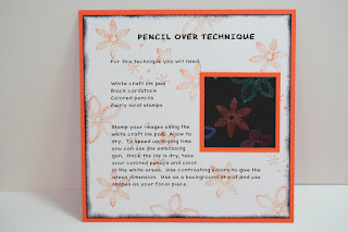
Technique Page Pencil Over

Isn't this a refreshing technique?? Here's a fun technique that I've had for a LONG time. It's a technique that has been around a while but not too many people do it. Why I'm not sure. It may be because the background needs to be dark?? Maybe because it takes a little bit of time to do. But there are other techniques that take a lot more time. I really don't know. It's not that it's not a popular one it's just not a well known one like cracked glass or the waxed paper resist one is. I like the technique and use it when I want something different.

For this technique you need a white craft ink pad, black card stock, colored pencils and fairly solid to completely solid stamps.

You stamp your images using the white craft ink. You do need to allow the ink to dry. You can speed up the drying time by using the heat tool. Once the ink is dry you will take your colored pencils and color in the white ares. Use contrasting colors to give the areas dimension. You can use this as a background or cut and use shapes as your focal piece.

You don't need expensive colored pencils for this technique. Any colored pencil will work. Though some of the really cheap ones don't have enough wax in them to leave much color behind and those tend to leave more of an indentation in your card stock than color!

Give this technique a try, it's a LOT of fun!!!

Thanks SO much for stopping by,
Wanda

Thursday, July 17, 2008

Wedding Card Redo Suggestion!!

Adding the wider ribbon made the original card much better in that area of the card. And this time I went with Crystalshope's suggestion of using the bride and groom from the Stampin' Up! "Viola to Go" set. I think adding that to the circle (just like the Mr. & Mrs. stamps did) let you know it was definitely a wedding card!!!

There were not that many elements to these cards which can sometimes be a good thing and other times can make a card look like you didn't finish it or got lost while designing it!!! I get lost a lot!!! LOL

I find simpler cards to be more of a challenge for me and there are times when I step out of my box and try out one of those simpler cards with very few pieces to it. And most times I produce a card I like and then there are times that the card becomes a struggle and I ask you for your opinion!!! I got a LOT of great ideas though I didn't have a lot of the stamps or supplies that were suggested. There's a lot of talented stampers out there!!! Why aren't you all blogging and showing your creations?????

It was fun doing this. I'll have to seek out your help again sometime soon. SO I will be contacting Crystalshop and getting her snail mail address!!!

I have some fun stuff lined up here for this weekend. NO, I don't have them done. I just have the ideas written down and am looking for the opportunity to play and create!!! With craft fairs coming up I like to share what I make for those and hope they will be a good seller!!!

Thank you SO much for stopping by,
Wanda

Wednesday, July 16, 2008

Wednesday Sketch Challenge at SplitCoastStampers

I took a break from re-working that wedding card I posted on Monday to do the Wednesday Sketch Challenge at SplitCoastStampers. This was fun sketch. I wasn't going to do a winter card but I had the photos sitting out and thought I'd give it a try. It's cute but nothing I would do for Christmas cards. I would have to cut out the top part, the snowman face from each photo using a x-acto knife and cutting very carefully and straight too! Something I could do but to do 130 of them I can pretty much guarantee you that about 80 of them will not be SO straight anymore!!! And think of the cramps in the hand!!! For this one I used two photos so I didn't have to cut out the center of the photo. But to do that many Christmas cards I would have to be a bit more frugal!! SO I just did the one for the Wednesday challenge at SplitCoast.

And then I made another one. The "To Have and to Hold" set was the one I had in mind when I saw the sketch. I was hoping the bride and groom would fit in the other direction but they didn't so I had to turn the card. My first thought with this was, had the bride and groom gone the other direction was to put the Mr. on one side of the couple and the Mrs. on the other side where that strip that goes through the middle is. But it didn't work out that way and this is what I came up with. I am still toying with the idea of doing the Mr. & Mrs. in a circle, layering it and adding it to the bottom right corner of the bride and groom piece.

I was SO fortunate to be able to play with the sketch and make two. This is the first time I've ever made two on the same day and two different ones at that!!!

Tomorrow I will pick another of the ideas that were left in the comment section on Monday's card and re-do the card with that suggestion.

Thank you SO much for stopping by,
Wanda


Tuesday, July 15, 2008

Technique Page Cracked Glass

Here's an oldie but goodie!! The "Cracked Glass" technique. This is a very fun technique to do too! And not very difficult, just a bit time consuming because of all the layers of embossing powder you need to heat. Using the Ultra Thick Embossing Enamel (UTEE) makes it go a little quicker because it's thick and melts thicker too.

Take your finished stamped image and cover it with the embossing ink pad. Sprinkle the UTEE on and heat it until it melts. Repeat this 4 to 6 times to get a nice thick coat over the image. Once you have it as thick as you'd like it, place it in the freezer for at least 10 minutes. Remove it and gently give the image small bends to crack it. Repeat the bending until the cracking has been achieved. Once the image warms up it will not crack but you can refreeze it and then crack it some more. To enhance the cracks rub a dark ink over the top of the surface and wipe off any excess. Layer onto card stock and use on your cards or scrapbook pages.

If pieces should crack off just put them back on if you can find them and reheat the whole thing. Put it back in the freezer and then crack it again. It's kind of hard to ruin it!!!

This is another page I will be including in my Techniques Page book and also will be included in the pages I will be giving away as Blog Candy when my blog reaches 500,000 hits. The numbers are rolling by fast and I need to start posting these more often or it's going to be a pretty slim book!!!

This item was made entirely of Stampin' Up! products. To view more items made entirely of Stampin' Up! products click here.

To see the other Technique Pages, click here.

Thanks SO much for stopping by,
Wanda


I Received an Award!!!

I received this award from Jeani at Scrappin' in Paradise. Thank you Jeani!!!

The rules for this award are as follows: 1) The winner can post the logo on her blog. 2) Link the person you received your award from. 3) Nominate at least 7 other blogs. 4) Put links of those blogs on yours. 5) Leave a message on the blogs you've nominated. So the 7 I am going to nominate are:

Sara
Melissa
Jan

Monday, July 14, 2008

Is Bigger REALLY Better?


Got your attention on that one, didn't I!!! LOL

On a few of the comments it was suggested that I try the bigger wider ribbon. SO here is what I did. I used the 7/8" Black Organdy ribbon. I hope Stampin' Up! comes out with the black in the wider grosgrain and a few more colors too!!!

I changed the champagne to the "Mr. & Mrs. from the Stampin' Up! "Together Forever" set. Tanya suggested this in an email to me. I will be emailing Tanya to get her snail mail address to send her a set of 4 of this layout. I had cut my "Mr. & Mrs." stamp in half so I could use each one individually. I cut it so I can still put the two pieces together and use them as one stamp too. I do like having the versatility of the two pieces.

I will play some more with your suggestions and select another "winner" of the suggestions to the first card. This is fun!!! I need a little bit of "change" in my life right now. It's kind of like one of those games where you have so many parts to a puzzle and everyone helps put it together!!! I LOVE getting these suggestions. It can show me things I've never thought of before or things I've forgotten. I'm not use to doing "simple" cards. Most of mine consist of at least 40 layers!!! LOL And it's obvious that I need help with the simple things!!!

Thank you SO much for stopping by,
Wanda

Sunday, July 13, 2008

What You "See" is Not Always What You Get!!! Challenge/Candy?

I had this card in mind. I wanted to make a very simple wedding card. I wanted to use the Cuddlebug folder. I wanted to use "something" in a 1/4" circle. I wanted to layer it with a larger circle. And I wanted it in black and white.

It's obviously in black and white. I did use the Cuddlebug folder. I did use the 1/4" circles layered and there is "something" in the circle. But this "something" isn't doing it for me. SO it looks like I'll be working on a few more wedding cards this week!!!

Any suggestions??? If I have the images and I use your suggestion I will not only post it here giving you credit but I will send you 4 with envelopes for you to use when you need a wedding card!!!

Thank you SO much for stopping by and I look forward to your suggestions!!
Wanda

Saturday, July 12, 2008

Technique Page Waxed Paper Resist

This is a VERY fun technique. I LOVE doing the Waxed Paper Resist on my backgrounds. There was a time that Stampin’ Up! had a background called "On Safari" that looked a lot like this. When I had that stamp I stopped using this technique but now that it’s long been retired I’m back to using this again.

This is another page that I will be adding not only to my Technique Book but also to the pages I will be giving away as Blog Candy when my blog reaches 500,000 hits!!! It's moving fast so I'd better get a move on these pages!!!

It is a very simple one to do too. I just don’t like to do it when DH is home. You see, I have several shirts hanging in the laundry room that need ironing and I would be asked why I could get the iron out for this but not for the shirts!! LOL And sometimes (SOMETIMES) I feel guilty when I do get the iron out for this technique and don’t iron the shirts. But the guilt passes once I get back to my worktable to play!!! LOL

Your waxed paper should be larger than the paper your card stock. Crumple up the waxed paper and straighten it back out again. Once it's crumpled it will be smaller, that is why you want it larger than your card stock. Sandwich it between your card stock. Place a piece of copier paper over the top of that. You don’t want any waxed paper to touch your iron. With the iron set on medium slowly iron over the papers. You can lift an edge and peek under to see if the waxed paper melted onto the card stock. The colored card stock is ready to use.

For the glossy card stock, ink up the brayer and roll it over the paper until the color become sone tone. The wax will resist the ink and only the ink color will show. It’s now ready to use!!!

In the photo here, the dark colored piece is the colored card stock and the lighter one is the glossy card stock. No two pieces will look alike. I like to cut my card stock in half because I don’t really need two full sheets of the background paper (unless I’m doing a swap and need a lot).

Pretty simple and VERY fun!!!

This item was made entirely of Stampin' Up! products. To view more items made entirely of Stampin' Up! products click here. For more Technique Pages click here.

Thank you SO much for stopping by,
Wanda

Friday, July 11, 2008

Weekend Project! Fun for the Kids!

This is a very fun coloring folder to make for the kids for those long rides to grandma’s house. I would think they’d be fun for party favors as well!!!

To make this project you will need the following items:
Colored card stock
3 sheets of Whisper White card stock
Double sided tape - preferably the Red Line tape
Fun to color in rubber stamps - kids themes
Decorative paper
Fastener
Corner Rounder (optional)

Start out with your colored card stock. Cut it 8-3/4" x 4". Score on the long side at 2-7/8", slide over to 3-5/8", 6-1/2" and 7-1/4". Fold all the score lines in using your bone folder to get a nice sharp fold.

For the box that will hold the coloring cards cut the card stock 4-3/4" x 3-1/4". Score on the long side at 1/4" and ½". Turn and score the other end the same. For the bottom part of the long side score at 1/4" and ½". You will be snipping away the bottom corner squares on each side leaving one for a flap. Cut away 3 of the 4 visible squares on the bottom corners. The one square left is the flap that you will fold in first when assembling this piece. So when you cut the 3 squares off the corners, make sure you cut the same 3 off on the other side. You will need to cut one side of the square left so it will be held on by one score line. Make sure you snip the other side to match or your flaps will be on different folds. And if that happens it is ok, it will still work.

I used a 3/4" punch to make the half circle mark on the center of the coloring card holder.

Next you will tape the flap in first and then the edges but you will tape them all at the same time. If you tape the flap first and secure it, it makes it a bit difficult to tape the other edges. It can be done but not very easy. Set the taped piece in place on the left large piece of the inside of the holder. If you happen to tape it on the right then you will just move your crayons to the left. Not a big deal. Kids aren’t picky when it comes to stuff like this. They just like getting "stuff!"

Using the Red Line tape, tape the crayons in place.


For the coloring pages I cut the white card stock 3-3/4" x 2-3/4". I cut 3 sheets of card stock up for this. Not all of my stamped images stamped clearly so I had room for error. Fill the holder with as many coloring cards as you’d like or that will fit.

For the front I used some fun decorative paper I ran across. I cut the larger piece 3-5/8" x 2-5/8". For the flap I cut that piece 3-5/8" x 1-1/4". I used the corner rounder on the two corners. I then taped them in place.

You have several options as to how you want the cover to close. I chose the easiest and the quickest. I used the seamless hair binders. Others will work, even rubber bands. You may want to find something that the kids can afford to lose! I had thought about using brads and hemp but then the brads had sharp ends and I didn’t want to have that on something that children play with. And I thought about using a magnet sheet but keeping in mind that kids set things anywhere I could only imagine what would be clinging to it!! SO I went with the hair binder.

This was a very fun project to make. And with August just around the corner and BIG sales on crayons it’s a good time to get some of these started and wait for those low price school supplies to make their way into your carts!!!

For more weekend projects click here.


Thanks SO much for stopping by,
Wanda

Thursday, July 10, 2008

Keeping it Simple!

I just wanted to make a simple card. I had dug out a tractor stamp by PSX. I embossed it in black on Real Red card stock. I layered it in white and black. I was a bit disappointed in the background. I was hoping it would show up more. I used Versa Mark instead of red ink. I prefer to use the ink that matches the card stock, it shows up better on the backgrounds. Live and learn, right??

But like I stated, it's a very simple card. Simple to make and simple looking too. No frills at all. Definitely a masculine card!!!

I like using embossing powder, only when I'm making a couple of cards at a time. But ask me if I like embossing powder after I've made a bunch for a swap!!! LOL

I like how it melts across the paper. Though with the very fine stuff you have to be extremely careful that you don't get a "grease spot" on your paper instead of the nice raised embossing. I find that if you let the heat tool heat up first then let it blow across your card stock it works much better. Keep it moving from left to right and then right to left, passing your design area before coming back across it. Just like you would use spray paint. Never emboss in a circular motion. Some areas tend to get over melted and that is when you get the "greasy spot" on your card stock. I'd have to say my favorite color to watch melt is the gold. You can just see it liquefy across your paper as you go. Plus this one, for me is the easiest to see where you missed too. But as for the black embossing powder, just hold the heat tool about 2-1/2" away and keep it moving. Never stop it in one spot. You are not only asking for that over melted spot but you are asking for a fire too. Paper burns at 451 degrees Fahrenheit and the heat tool gets much hotter than that. I believe you could even melt the paint off your house with that thing!!! Pretty scary!!! LOL I usually have a fire extinguisher close by when I use any tool that gets that hot. It's just best to be safe than sorry. And if you don't have a fire extinguisher it's best to go purchase one, they are not that expensive. But in the meantime you can make sure you have a bowl of water sitting by to drop the flaming paper into or a wet (not damp) towel on your work surface. Just take all the preventative cautions you can!!!!!

I have a very fun "Weekend Project" for tomorrow. It's one that is geared for the little ones!! I'm going to be making some extra ones to sell at the local craft fair this fall. I'm hoping they will be a good seller!

Thanks SO much for stopping by,
Wanda


Wednesday, July 09, 2008

SO Much Cake. SO Little Time!

Saying goodbye to the Stampin' Up! "Eat Cake" set. I have LOVED playing with this set, haven't I Sue? I had borrowed hers enough that I had finally broke down and bought my own. I will probably keep this set for a while longer just because I still like it.

I used this set in the Splitcoaststampers Sketch Challenge today. I wanted to do this challenge but this card wasn't what I had in mind when I took this set out. Once I figured out the size of the area I was going to be working with it dawned on me that I didn't have the space I thought I would. This layout is a bit deceiving. But it worked, just in a smaller scale. I do wish I would have changed a couple of things. Making the layer around the cake 1/8" larger and stamping the candles in a darker color.

In person it looks a lot different. Anyone who receives it will know it's a birthday card!! Even without the words I wanted to originally add to it!!

It's bright and cheery, that's for sure!!! LOL

In addition to the "Eat Cake" set I used the little cupcake from one of my favorite tiny sets "ABC Images." SO many things you can do with that set!

This item was made entirely of Stampin' Up! products. To view more items made entirely of Stampin' Up! products click here.

Thanks SO much for stopping by,
Wanda

Tuesday, July 08, 2008

Goodbye to Touch of Nature!

This card was pretty easy to make. Easier than saying "goodbye" to this set. I have really enjoyed this set. I found it to be VERY versatile. It worked for MANY occasions plus both genders.

I was able to use a piece of retiring decorative paper too. I'm assuming it is retiring, I don't have the official word on that one though but most of their papers retire and new ones come in!! I just love the Really Rust and Groovy Guava together.

The main part of this card is cut a bit smaller than you would for a regular size greeting card. I started out with a half sheet of card stock and folded it in half. I cut off 1/4" on the top and on the non-folded side. Then I opened it and cut the front piece to work with my design. I had already decided what I was going to put on the front. I had stamped it and layered it. After my layer went on I knew how big to cut my designer paper and once that was cut I was able to measure how big I wanted the front part of my card to be. Again I used the 1/4" border around. I like things symmetrical!! For the front of my card I cut off 1-1/4".

I mounted my small card on a piece of Groovy Guava cut 4-1/4" x 5-1/2". The inside layer is cut 3-3/4" x 5". I was going to use vanilla inside but the guava seemed to blend better. And the guava is light enough to write on too.

I had added my ribbon to the decorative paper before I taped it in place. I sponged the edges of the flower before I attached it to the Really Rust layer. I used a blender pen and Groovy Guava ink pad for the flower. The center of the flower is Apricot Appeal directly from the marker and the stem is done in Mellow Moss directly from the marker. After I colored the flower in I sponged over it with Apricot Appeal.

A pretty basic card. Simple but yet pretty!

This item was made entirely of Stampin' Up! products. To view more items made entirely of Stampin' Up! products click here.

Thanks SO much for stopping by,
Wanda

Monday, July 07, 2008

A Treasure Awaits!!

Isn't this a fun set. I believe it is retiring too. I borrowed this set (a while ago) from my friend Gerry. She's such a sweet lady. She was one of the DIVA's but has since retired. She's very talented and such a wonderful person!! I thought I should play with this set since I've had it here so long.

It was a lot of fun. I'm going to try out one more card with this set. This card didn't turn out the way I wanted it to. I want to work the treasure chest into the next card. It's such a cute little thing!

For this card I used the wheel and made the background "map" part of the card. I stamped the "sailor" and layered him after I colored him in. For the coloring of him I used markers, no blending. Just straight from the pen. I wanted the colors bright and solid.

The "map" was colored in with markers as well and for the sand and water I just sponged the color in. I did use a white crayon on the mountain top and the ship sails so the sponging wouldn't color those areas in.

I stamped the wording and punched them out with the circle punch and layered it on top of a larger circle. I added a piece of caramel ribbon and tied it in place.

It was a fun card to make. I wish I would have played with this set a bit sooner. I don't have any children's sets and I think I may have to look in that section of the new catalog when it arrives. It's always fun to have a children's set around. Keeps the little ones busy while you do other things and you don't have to let them play with your other sets!!! Can you tell I don't share very well??? LOL

On a personal note here. Today was a very difficult day for me. Today was the funeral for my mother-in-law. I have to say that I was SO fortunate to have had a wonderful mother-in-law like her. She was always SO good to me and treated me like one of her own children. I'd never known such love before. She will be missed for a LONG time. Her last words to me were "I have always loved you." And I know she meant it. She was love by all who came in contact with her. She was one of those people you loved the minute you met her. As far as mother-in-laws go, I was the fortunate one, I couldn't have asked for a better one than her!

This card was made entirely of Stampin' Up! products. To view more items made entirely of Stampin' Up! products click here.

Thank you SO much for stopping by,
Wanda

Sunday, July 06, 2008

Glitter Window Technique Page

If you are following along this is page 6 of the "Technique Book." To view the other pages you can click here. And also if you were following along you will know that I am making extra pages so when my blog reaches 500,000 hits I will be giving away one of my "Technique Books" all done in sleeves and a handmade cover that you can either keep as is or put in you own 6" x 6" album! Plus I always toss in extra things as the blog candy random drawing is going on!

So back to this page. This is the "Glitter Window" technique. It's a very simple technique and adds a lot to a card or scrapbook page.

To do this technique you will need clear wide packaging tape and dazzling diamonds glitter.

You will make the windows of your card or page by using punches or the Coluzzle Cutting System. Once your holes are done take the smaller hole and place the tape over the back side of it. Sprinkle it with the Dazzling Diamonds glitter and tap any excess off. You can place your image eight on top or behind the glitter. The page shows both. You can stamp directly on your page and add the window on top or you can make your window and cut out a piece to set on top. Either way is cute and fun! Be sure to give this one a try, it's very simple and SO cute. My favorite stamps to use with this technique are snowman stamps. I stamp my snowman and put the window on top so it looks like it's a snowy day! SO cute!!!

Thank you SO much for visiting,
Wanda

Saturday, July 05, 2008

Weekend Project! Cards and Notebook Holder

Ok, let's get started!!!

To make this project you will need the following:
Two 12" x 12" pieces of card stock
One 8-1/2" x 11" piece of card stock
Notebook
Pen
4 Envelopes
4 cards
Decorative paper
2 brads
Hemp

Cut a piece of the larger card stock to measure 7-1/2" x 12". Score from left to right on the long side of the 12" piece as follows: 2" slide over to 2-5/8", 8-3/8" and 9".


For the 7-1/2" x 11-1/4" piece score on the long side at 5-5/8" or just fold it in half.

Fold all scores on both pieces.

Tape the 7-1/2" x 11-1/4" piece to the 2" folded piece on the left side of the piece you first scored. You will want to tape this near the fold and a few other places, including the top and bottom edge to hold it shut and hold it onto the 2" folded piece.

The piece on the right side of the 7-1/2" x 12" piece that was scored at 9" is the flap/cover. You can leave the corners as they are or you can trim them up as you wish. I made mine rounded. I took a dinner plate and used it as my template.

For the box-like piece that holds the cards you will need a piece of card stock cut 6" x 8". On the long side score at ½", 1", 7" and 7-1/2". Turn and score at ½" and 1". Fold all score lines. Cut away 3 of the 4 visible squares on the bottom corners. The one square left is the flap that you will fold in first when assembling this piece. So when you cut the 3 squares off the corners, make sure you cut the same 3 off on the other side. You will need to cut one side of the square left so it will be held on by one score line. Make sure you snip the other side to match or your flaps will be on different folds. And if that happens it is ok, it will still work. You will tape the flap in first and then the edges but you will tape them all at the same time. If you tape the flap first and secure it, it makes it a bit difficult to tape the other edges. It can be done but not very easy. Set it in place on the large open space next to the flap/cover. You will want it to be about ½" to 3/4" from the bottom.

Notebook: My notebook measures 3-1/2" x 5-1/4". There is a lot of space for many different size notebooks. You just want to be careful that if you buy or make one with a spiral that the spiral is at the top and you tape it in place so the spiral sits above the card holder. After decorating it the way you like, turn it over and set it on top of the card holder piece so the spiral is hanging over the top (side) of the holder. You don’t want it to sit on top or the entire holder will be too bulky. If it hangs over the edge of the card/envelope holder it will still lay flat enough to close it nicely. Try it out first. Just set it on top of the card/envelope holder and close it all up. You’ll see how bulky it is. Just slide it up until the coils go above the card/envelope holder and close it. Once you understand where this should lay on the left side, tape it in place.

For the pen I just took a ½" piece of scrap card stock I had left over from decorating my holder and I wrapped it around the pen, overlapping it about 1/4". I taped it around the pen, making sure it wasn’t too tight, you do want the pen to come out!!! I taped the card stock around the pen and set it in place above the notebook.

For the fastener I punched out two 3/4" brown circles and two 1/2" inch Groovy Guava circles. I layered them and held them in place with the brad. I set them in place with the brads on the holder and tied a piece of hemp to the one of the flap and just wrap them around the bottom and back up to the top to secure it.

And that’s pretty much all there is to this. SO fun to do!!!

Decorate yours as you like and make matching cards and you have a FABULOUS gift for someone!! I'm a little disappointed in mine. On the inside part where the cards go I had the decorative papers going the wrong direction and of course it was my last sheet of that paper too!!! SO it's not the way I'd like it but it will just have to do!!

For more weekend projects click here.

This card was made entirely of Stampin' Up! products. To view more items made entirely of Stampin' Up! products click here.

Thanks SO much for stopping by,
Wanda

I Have a Store!

I have a store where I will be selling rubber stamps I no longer want. Many of them have never been used. I will not only have photos of the front of the stamp but also of the back so you can see what condition the rubber is in. The rubber on all of the stamps I will have there will be in good supple condition. I treat all of my stamps with the Stampin' Up! Stampin' Mist. It helps preserve the rubber.

I will also have some handmade items there and some stamping supplies as well. And eventually I will get some of my clay things on there too!!

Click on the link to see the "Christmas in Clay Online Store."

The store has an automatic check out through PayPal or you can use the "money order" option.

The shipping is based on the weight of the item being mailed in a padded envelope or Priority Mail box depending on what and how many you order oh and our zip codes. Mine is 55434. You can also check the information at the United States Post Office. I think the website may be set up to tell you how much shipping is before you purchase too. It's an awesome site. I will go to the post office a couple of times during the week. The local post office is only a few miles away (which is good since I'm such a chicken when it comes to driving!!) and I usually have other business in that direction on Tuesdays and Thursdays.

Check back at the store often. I have LOTS of stamps I will be selling. I need the space and I must let them go. I will also be adding some retired Stampin' Up! ones too for those of you looking for that certain stamp set that got away from you!

Thanks SO much,
Wanda

Friday, July 04, 2008

Weekend Project! Light the Way!!!

Wishing you all a Happy and safe 4th of July!!!
What a fun project this is!!! I saw it on Debby's site "Debby's Stampin' Heaven." She has a link to the directions. It's VERY easy to make. Though I did change the directions just a little. I wanted to be able to add one of those battery operated candles to the lantern. After all a lantern should be lit. PLEASE don't use real candles or tea lights. Your PAPER lantern will catch on fire. NOT a good thing!!!

You can see inside my lantern that I put one of those batter operated candles inside it. It's SO cute!!! I think these would be fun at Halloween. I will have to try (TRY??? LOL) to remember to make these around Halloween time!!! I think they would be fun for evening parties, weddings, etc. Lots of things you can use these for.

Anyway, for the base of the lantern I had taken an insulated paper coffee cup. It's one of those that has the plastic lid. The brand I used is Dixie "Grab 'n Go." It was nearby and it fit. You can use any brand that will fit in the opening of the lantern. I measured 3/4" up from the bottom of the coffee cup and marked it in several places all around the cup. I took a craft knife and cut around the marks. I used Tacky Glue and ran a thin bead around the outside of the piece. Then I dropped it inside the lantern. Now this works much better if you do this BEFORE you put the handle on the lantern!!!! Speaking from experience here!! LOL

The cup bottom won't fit perfectly inside the lantern but you will be able to get many of the edges to stick. The plastic candle is lightweight so you don't have to worry about not having it glued all the way around. The areas where the glue took on mine were just enough and it appears to be sturdy enough too.

Once you add the base in then you can put the handle on.

This is a pretty quick project to make. I was surprised at how fast I was able to cut and assemble it. You can add as much or as little decorations to it as you like. These would be a fun Stamp Camp project. And it would be an excellent project for kids since it doesn't require many materials or a lot of skill either!

This item was made entirely of Stampin' Up! products. To view more items made entirely of Stampin' Up! products click here.

Thank you SO much for visiting my blog,
Wanda