Monday, June 30, 2008

Baroque Anniversary!

I should say "Baroque Belated Anniversary!" I told you I was late with stuff this month! One good thing, the month is over at midnight!!! LOL The birthday card I made for my nephew yesterday I will be giving it to him tomorrow. He will be coming over to mow the lawn for us. I don't do mowing. That mower is SO huge and heavy plus it's got that power wheel thing going on and I'm NOT into jogging while I mow!!! And DH has been with is mother so he doesn't have time to do the lawn. SO (if I remember) I will be giving my nephew his card. Now it's his mom (my sister) and dad that I'm made the anniversary card for. I am even later with that one!!! I'd LOVE to be caught up! And I have a new start tomorrow now don't I?? LOL

So onto this card. I used the "Baroque Motif" set by Stampin' Up! Even the flowers on the card were included with this set. The words I did on the computer and then I punched them out with the oval punch. I have a lot of trouble adding only two layers on the wording to cards because you don't have much of a choice in colors. If I would have went with the burgundy it would have blended in with the bottom and you wouldn't see it very well and sticking with the Sahara Sand it blended in with the main part of the card. I did drop the words down to the lower right because that area needed a little something. Plus I think the words would have gotten lost had I added them to the main part of the card. I think just one more size oval punch would be ideal!!

This was a very simple card to make. Not a lot of frill to it at all. I don't feel there is any room for ribbons or bows but I could have added some Dazzling Diamonds in the center of the flowers. But I'm not going to do that! I like it the way it is. Though it is for my sister and she could stand to wear some glitter for a day!!! *insert evil grin here* LOL

This item was made entirely of Stampin' Up! products. To view more items made entirely of Stampin' Up! products click here.

Thank you SO much for stopping by,
Wanda

Sunday, June 29, 2008

Belated Birthday!

Last Thursday was my nephew's birthday. I missed it. It's SO sad because usually he gets his card early because I always make a mistake on the date of his birth. I think it's the 19th but it's really the 26th. And his cards were always early! This time I didn't forget his birthday. I remembered it and I also remembered it was on the 26th. I just didn't find the time to make him a card and I certainly wasn't going to go to the store and buy him one. That's just silly!!!

SO here's his birthday card. Just plain and simple. He likes to hunt and fish so I thought I'd use the "Nobel Deer" set. It's going to retire soon, along with the "Flannel Plaid" background stamp I used. I'm REALLY going to miss that one. I've had a LOT of fun with that stamp. And it's got such a masculine tone to it. I'm REALLY hoping that Stampin' Up! comes out with a LOT more masculine stamps.

Anyway, I kept this card simple. I used Always Artichoke, Night of Navy and Whisper White card stock. I used Always Artichoke ink on the deer, words and background stamp. I used the ticket corner punch on the corners and the two oval punches for the wording.

The wording came from the "Date to Remember" set. I used to dark blue brads on either side of the ovals. It just seemed to balance things out. I didn't want to add any ribbon and bows were out of the question. I wanted to keep the card looking masculine and somehow a bow doesn't say "masculine" as well as a brad does!!!

I'm sure he will like it and if not I know he'll like the money inside it!! LOL

As with all of my posts, to get a closer view just click on the picture.

This item was made entirely of Stampin' Up! products. To view more items made entirely of Stampin' Up! products click here.

Thank you SO much for stopping by,
Wanda

Blog Candy Winner!!!

Before I tell you who won the blog candy I have to tell you the story about this little bird.

I was walking by our HUGE pine tree on the way to the mail box and I heard a noise. It sounded like a bit of a ruckus going on in there. Coming back from the mail box I saw something fall from the tree. I look and there was this tiny little bird. And a second later another one. I wondered if I had startled the birds walking by and they fell out of their nest. SO I got out the ladder and I was going to put them back in the nest. I could see the nest but I needed the ladder to reach it. Two things here. One I'm afraid to climb past the third step on a ladder and two our ladder is a million years old and rickety. Nice!!!

Anyway, I pick up one of the little birds. Oh my do they ever have a HUGE pair of lungs. That little thing chirped SO loud I had to look in my hand to make sure it really came from there. Oh and when I looked in my hand I saw all of these tiny little (size of a grain of salt) dark dot moving on my skin. EWWWW.

I got on the ladder with the little bird in hand and put it back in the nest. Meanwhile the daddy bird is not liking this and he's swooping at me. So if I was to take a tumble off the ladder I don't know if I would blame me or the daddy bird!!! LOL I now have the second bird in hand and up the ladder I go. I put it in the empty nest. Empty?? What happened to the one I just put back? It's back on the ground. SO I pick it up again and up the ladder I go. They didn't want to stay in the nest so I put the ladder away and just watched them for a bit.

Now the mother bird is there keeping her eye on one of the babies and the daddy bird is watching the one in the street. I did intervene on that one. NO playing in the streets!!! I picked it up, bugs and all (another EWWW) and put it back in my lawn under the shade of the maple tree. This time the baby was so use to me it didn't chirp. I didn't know if that was a good thing or not. I think they should be afraid of people. But as many times as I handled the little bugger it was no longer afraid of me. I got my camera out and took a few photos before I let them go off to face the world. I couldn't believe how ugly the actually were. There were no tail feathers so how could a baby fly??? And I could see the ear holes on the side of head, either the feathers weren't thick enough or this little bird had premature balding!!! LOL Later in the day I saw the daddy bird in the neighbors yard. I suppose he was following one of the babies. And the mother bird was a few houses down the street in the other direction. It was an interesting day and it was the first time I'd ever seen (or held) baby cardinals!

Some of you know your birds and got it right. If I had to guess from that photo it would be just that, a guess. It's kind of cute with the big eyes and all but would be cuter with more feathers. Did you ever notice that most baby creatures are SO cute except for fish??? LOL See how this warped mind wanders??? LOL Feel sorrier for my husband!!! LOL

So the winner of the blog candy was done using the random number generator found on the right side bar. And the winner is Claudia. Here is her guess: "I think it is a baby Blue Jay because of the crest forming on it's head. Plus it is in a pine tree, where they usually nest. And thanks for the chance to win the great blog candy!"

Claudia please email me with your snail mail address or you can leave it on a comment to me that I won't publish. I will get the package out to you soon.

Thank you all for playing along. It was a LOT of fun!! I will be working hard on getting more technique pages done so I can offer a technique pages book when the blog gets to 500,000 hits. It will happen before I know it!! And thank you for your patience with my late posting of this. I also want to thank you for the prayers. I saw my mother-in-law again today. It's SO sad. She has always been a good mother-in-law to me. She always treated me as one of the family and she has always loved me! She's a wonderful and remarkable woman.

Happy Stamping!
Wanda

Saturday, June 28, 2008

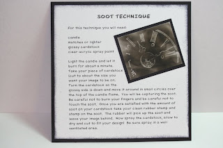
Soot on the Page! Technique Page!

I have another technique page for you. I decided that since I am nearing the 500,000 mark I will start my blog candy early. I want to have enough pages for a book so I can offer that when the time rolls around!!! Plus some other stuff too.

This is an older technique but still a fun one. I'm REALLY hoping that Stampin' Up! comes out with a new spooky Halloween house this fall. This technique is such a fun one to do with this technique! I taught a class on this once and we used a haunted house. It turned out SO cute!!

This is a VERY simple technique. I do have a bowl of water and a wet cloth by me when I do this technique. The bowl should be large enough to toss the paper in should it catch on fire I have never caught a page on fire yet but there is always a first time. But I do like to have something ready just in case. I even bring the fire extinguisher within reaching distance when I do this technique. It's best to be safe than sorry. I suppose you could always do this outside on a calm day.

The instructions for this are very simple. I will just type them right from the page. You will need a candle, matches or lighter, glossy card stock and clear acrylic spray paint. Mat or glossy it doesn't matter. I used glossy and you can't tell.

You light the candle and let it burn for about a minute. Take your piece of card stock (cut to about the size you want your image to be on). Turn the card stock so the glossy side is down and move it around in small circles over the top of the candle flame. You will be capturing the soot. Be careful not to burn your fingers and be careful not to touch the soot. Once you are satisfied with the amount of soot on your card stock take your clean rubber tamp and stamp on the soot. The rubber will pick up the soot and leave the image behind. Now spray the card stock, allow to dry and cut to fit your design. Be sure to spray in a well ventilated area.

That's it, pretty simple. I like to cut my card stock a bit bigger so I have somewhere to hold on. Your fingerprints will remove the soot so you need to give yourself a little room to hold on. Try to avoid touching any area of the stamped image. Anything that touches it will remove the soot. Once that happens there is no saving it. Try to spray it as soon as possible to avoid any mishaps.

You can also try tipping your card stock a little to see how the soot is going onto the card. I usually stand and nearly hover over it. You can see the flame through the paper enough to know you are very close to the paper and the tip of the flame. You will be able to see how close you need to be to the flame the more you work with it. You do need to keep the paper moving though or you will have a fire. That is why I HIGHLY recommend the water, wet cloth and fire extinguisher be by you before you begin this technique.

I will do the blog candy drawing tomorrow. I am feeling very sad today. My mother-in-law is not doing well and I doubt she will make it more than another 3 or 4 days. It's SO sad. I apologize for being late with that.

This item was made entirely of Stampin' Up! products. To view more items made entirely of Stampin' Up! products click here.

Have fun with this and BE careful! Skin burns too!

Thanks SO much for stopping by,
Wanda

Friday, June 27, 2008

It's in the Bag!!!

I decorated this bag for the Stamp Share. Terri had a challenge for us. It was to decorate one of the white Stampin' Up! paper bags.

For mine I used the "Boho Backgrounds" stamp and stamped the image all over a piece of Whisper White card stock using Basic Brown ink. I colored the flowers in with Pretty in Pink and the leaves in with Sage Shadow. I taped the sheet in place on the front of the bag. I punched out a couple of pieces using the Round Tab punch. I attached it to the handle area using brads from the Hodge Podge Hardware kit.

I stamped and cut out a few flowers from the "One of a Kind" set. It's one of my favorite sets!! And I added a couple of circle quarters to the bottom corners. I used the white gel pen to add the stitch marks. I took a few half round pearls from the Pretties Kit and added them to the flowers. It was a pretty fun challenge. My favorite thing to do was to make my own background paper using the stamp from the "Boho Background" set.

Our next challenge from Terri is to come up with something using the 6 round coasters she gave us. My mind is blank right now on that challenge. It's going to take some thinking for this challenge!!

This card was made entirely of Stampin' Up! products. To view more items made entirely of Stampin' Up! products click here.

Thank you all SO much for stopping by,
Wanda

Thursday, June 26, 2008

Weekend Project! Scratchpad Holder!

On Saturday I demonstrated how to make these FABULOUS refillable scratchpad holders. I had forgotten to write down part of the measurements and I also forgot to meantion where I found the idea when I was up front demoing. I get VERY nervous up there!!! Lisa Somerville at Splindiferous Creations came up with this idea. Or she was the first to post it. Either way I got it from her blog a LONG time ago. I like to make them!! They're a LOT of fun and SO easy to make. The step by step instructions that can be found on Lisa's blog are very clear and precise.

I find decorating them to be the best part. Not only because of how cute you can make them but because you can spend a bit of time decorating them and not feel bad that they will be tossed out right away because they are refillable!!! Yup, you can refill them!!! How cool is that??? You just slide the old one out and slide the new one in and it's good to go again!! I add my business label to the back of them so my information is always available!

Aren't they fun? You can use them for Customer Appreciation events, Hostess Gifts, Make N Takes, Craft Fairs and Gifts. Lots of possibilities here!!
For more Weekend Projects, click here.

I had purchased my scratchpads at Staples online. They had the best price. I bought them about a year ago. You may want to do a bit of shopping around to check and get the best price. I was a bit shocked at how much scratchpads were. I mean, it's just suppose to be leftover paper that is made into notebooks! One thing I did find out about Staples pads as opposed to the ones at Office Depot. Staples ones are uniform in shape. Office Depot ones are not only all NOT the same size but they are cut crooked too.

These items were made entirely of Stampin' Up! products. To view more items made entirely of Stampin' Up! products click here.

Thank you SO much for stopping by,
Wanda
Technique Page Problems

Many of you are having problems connecting to the Techniques Class Booklet. I had clicked on the link that I provided for you and I was able to get there. I also entered in the SplitCoastStampers (SCS) search window "Techniques Class Booklet" and I was directed to a page with many classes and somewhere in the middle was the "Techniques Class Booklet." I couldn't tell if it was a "demo's only" site or not. If you and can not access it you will need to sign up somewhere on SCS for that. I did it several many years ago and I don't know remember how to go about it. I think I may have asked one of the forum people how to do it or maybe I asked one time when I got that "you don't have permission to access this page" pop up that you have been getting.

I'm sorry you are unable to access it. It opened up to a word program and you printed out the information on card stock and made a small booklet that you add the technique to after you do it. It's a bit old but it did have the earlier basic techniques in it.

All I can do is suggest that you contact SCS and ask how you can access it.

Best wishes to you there,
Wanda

Wednesday, June 25, 2008

Faux Eyelets Technique Page

At the Stamp Share on Saturday I had demonstrated a couple of things. One of them was the Faux Eyelets. This is a fun technique. It allows you to make Faux Eyelets using any of the Stampin' Up! colors.

You take your Crop-a-dile and with the smaller punch, punch a hole in your card stock. Then you take the 1/4" round punch, line up the hole you just made so it's centered and then punch it out. That's it. Simple as that you have a Faux Eyelet. Add them to your cards or scrapbook pages. It allows you to not only have eyelets in many colors but it helps in not having to pay that extra surcharge when it comes to mailing it!!!

I even took the time to make a technique page of this for my Techniques Book. The book is starting to look a little fuller now and it's even getting impressive!!! LOL I have LOTS more quick and simple techniques to share with you and add to my book!

Here is a link from SplitCoastStampers that I found some easy pages to make your own Technique Book. The link contains a file for you to download that has techniques already typed out for you. All you do is print them out and add your personal copy of the technique. The gal who did them, Craftdoc put a lot of time and effort into making this and then sharing it with everyone. Just click here for the link to the page on SplitCoastStampers website. They are fun for starting out your technique booklet. I prefer the 6 x 6 pages myself and you can easily copy the wording onto 6 x 6 pages and follow the technique so you have an image to attach to your page.
Click here to see a few more Technique Pages I've made. I plan on posting more of them as I create them.

This card was made entirely of Stampin' Up! products. To view more items made entirely of Stampin' Up! products click here.

Thank you SO much for stopping by,
Wanda

Tuesday, June 24, 2008

Fun Folds!

I was able to participate in the every SO fun Shoebox Swap last Saturday. A shoebox swap is where yaou design a card and make and bring all the supplies for everyone in the swap to stamp and assemble your card. This is a VERY fun time. You go from table to table making cards. The theme for this one was FABULOUS and SO fun. It required using different folds on your card. Mine had two folds. Nothing out of the ordinary, nor too fancy. Just quick clean and simple. The rules stated that the cards should be something that could be done in 5 minutes. To me that was a bigger challenge than coming up with a design!!!

And this is what I had come up with. I used the designer paper from the "Berry Bliss" collection. I wanted something soft looking. I used the "Birthday Wishes" stamp from the "Sincere Salutations" set. I had pre-folded my cards so it would stay under the 5 minute deadline!

I took a photo of the card open on one side so you could see how it opened and all went together. At the swap there were some simple folds and some a bit more complicated too. A very nice variety of fun folds to keep a person entertained!! I have quite an array of samples to show my customers!!
Measurements for this card are as follows:
I'll add the measurements to the post.

The card stock measures 11" x 5-1/2"
Score (going from left to right) at 1-3/4", slide down to 3-1/2" slide down to 8"

With the scored piece facing up, fold the first score outward.
The next score folds inward and the last one also folds inward

I actually cut out a half circle to accommodate the scallop. It helps the scallop to lay flatter when the card is open. For this you just punch out a 1-1/4" circle and use it as your template. Place half the circle on the fold where you'd like the scallop to go and trace it. Cut around it with an x-acto knife. This will lay open over the larger fold on the right side of the card. It won't show once the scallop is put on.

The layers of card stock and decorative paper are as follows:
1-1/2" x 5-1/4" (Chocolate Chip) and the decorative paper is 1-1/4" x 5"

The larger side is cut:
2-1/2" x 5-1/4" (Chocolate Chip) and the decorative paper is cut 2-1/4" x 5"

There is a 1-1/4" on the pink circle and the smaller circle is 3/4"

When layering the larger (right) side. Line up the layers on the top, bottom and right side only. The left side will show more vanilla but that's ok, when the card is folded shut it won't how.

This card was made entirely of Stampin' Up! products. To view more items made entirely of Stampin' Up! products click here.

Thank you SO much for stopping by,
Wanda

Monday, June 23, 2008

A Bit of Vellum!

Here is another card I did for the "Vellum" theme swap. I had stamped the image from the Stampin' Up! set "Fresh Cuts." A preview set that will be in the new upcoming catalog!!! Such a fun and exciting stamp makes me anxious to see what other fun and exciting things are waiting for me to purchase!!! LOL

I layered the vellum piece on top of some More Mustard and that was layered on top of a piece of Basic Black. I secured it in place with 4 gold brads. I put Dimensionals on under the black layer and set that on top of the Taken With Teal and More Mustard layers. I had used the stamp from the set and Versa Mark and made my own background. I used the "For You" words on Taken With Teal, punched them out with the 1-1/4" circle punch. I then punched out a white 1-3/8" circle and layered both of those on top of a Basic Black scallop. I used a couple of Dimensionals under one side of it to keep it level with the rest of the scallop.

I tied the black grosgrain ribbon around the More Mustard (1") and Basic Black (1-1/4") layer. For the ribbon I usually wrap it around the piece and tape it to the back. I leave about 3/4" of ribbon on the back for taping. Then I adhere it to where I want it on the card. After that I take a piece of ribbon and slip it under the taped one and tie a bow. Doing this allows me to slide the bow along the ribbon and get it exactly where I want it!!! Wrapping the ribbon around the entire strip can cause the strip to buckle a bit plus the knot will lay differently and is not easy to move! There is no right or wrong way to tie a knot, I just prefer to do it this way.

This card was made entirely of Stampin' Up! products. To view more items made entirely of Stampin' Up! products click here.

Thank you SO much for stopping by,
Wanda


It's Blog Candy time!

Yup, Chatty Cathy time! I have over 800 posts on my blog now. WOW, and a big UNREAL in there too!


Close up of the clear stamps set by Scrappy Cat. LOTS of fun flowers. Plus I'm adding some stick on rhinestones, double sided tape and some foam dots. The other photo shows the other items. And many times I add some extra fun "stuff" as I run across it in my workroom supplies!!


Nothing is FREE so here's what you need to do!!!! Just leave a comment on this post only. Leave your guess as to what bird this baby bird is in the photo!!! Hint, it's NOT a bald eagle!!! LOL Please don't include your email address in your comment.


I will draw a name using the "Random Name Generator" on Friday evening on June 27th. Check back on Friday evening to see if you're the lucky winner.


Have fun!
Wanda


Sunday, June 22, 2008

Using That Decorative Paper!

What a better way to get yourself to use your decorative papers than to participate in a sway. The theme for this swap was to make a card using the Stampin' Up! "Prints Designer Series" paper. I was going to save this striped paper for the origami masculine shirt folding but I thought it would blend well with these colors so I used it. I know, it's better to use it than to hoard it. Like I don't have a ton of paper I'm hoarding as it is. But there is still some paper left so I can make a shirt sometime down the road. Does that day really ever come??? LOL

I had to try to figure out a layout that would allow me to make the cards using the decorative papers but I need to make sure I could make the 16 cards and have enough paper to do this. I liked this layout and did the math to see if it would work and I actually had just enough paper to pull it off!!!

Originally I wanted to use the "Lots of Dots" jumbo wheel but I just couldn't get the dots straight nor could I get them to line up evenly on the second row of dots. The first one I did was pretty good and after that, well let's just say it was the very reason why I decided to go with the "Dotted" background. It was SO much easier to work with!!!

I used Almost Amethyst card stock and ink with this card. The "thank you" is from the Stampin' Up! "Holiday Blitz" set. That is one little "thank you" that I find comes in VERY handy for LOTS of cards. The words just fit so nicely inside the 1-1/4" punch plus it layers up so nicely with the 1-3/8" circle punch and the scallop punch!!

I had added some 1/4" white grosgrain ribbon to one of the panels and as I was lying things out I noticed that the other panel just screamed for something. Another strip of ribbon looked silly there. And then I thought I should add some black brads. Well 5 black brads for 16 cards just didn't work because I didn't have enough of them. But I had LOTS of eyelets. And I got to play with the Crop-a-dial to install them. There was no hammering involved so I was able to do them at 1 am and not wake up anyone!! It sure makes punching and setting eyelets in place a breeze! And a quite breeze at that!!! LOL

It's basically a simple card to make. It's got a few layers to it but it goes pretty fast. I enjoyed making this card and it was nice to be able to use the decorative paper too!!

This card was made entirely of Stampin' Up! products. To view more items made entirely of Stampin' Up! products click here.

Thank you SO much for stopping by,
Wanda

Saturday, June 21, 2008

To the Moon and Back!

This is a card I made for the Stamp Share card swap. The theme for this swap was to make a card front using two of more of punches from a list provided. I chose the Large and Small Star punches. And what goes well with stars??? The rocket stamp of course!!! The rocket stamp came from the Stampin' Up! "Fun Pun" set. I've used the rocket stamp a lot and I think I have a lot more cards to come using it. It's just a cute and fun stamp to play with.

I also used "Priceless" set for the "smoke" coming out of the back of the rocket. The background was done using the jumbo "See You Around" wheel. That wheel reminded me of asteroids. I used it on Sahara Sand and Old Olive ink. It was layered on top of Soft Sky card stock. The decorative paper came from the "Fall Flowers" decorative paper. I sponged the edges of that piece using Old Olive ink.

I stamped the rocket using Black Staz-on and watercolor paper. I colored the rocket with markers. I colored directly on the watercolor paper with the markers. The colors were subtle enough to be able to do it without making the color too dark. They blend well with the rest of the colors on the card. I used the jumbo eyelets on the window part of the rocket. It gave it more of a spaceship look adding those. I have never used them yet and thought it was time to give them a try too!!! I have too many supplies I have never or hardly ever used. I think I need to challenge myself to start playing with those items more. They do add a lot to cards and scrapbook pages.
This was a very fun card to make!!! And I have to say that the Stamp Share was such a blast. There is a wealth of information at this event plus fun things to do and see. I always bring my camera and a notebook because there is just SO much that you can't remember it all. And it's a time to visit with some fun and talented ladies I only get to see at this meeting. Terri (the gal who puts this on) is an incredibly talented lady. I always look forward to her Stamp Shares.

This card was made entirely of Stampin' Up! products. To view more items made entirely of Stampin' Up! products click here.

Thank you SO much for stopping by,
Wanda

Friday, June 20, 2008

Chalkboard Technique Technique Page!!

I had a lot of questions come in on the "Technique Book" that I am adding pages to. I purchased a 6" x 6" scrapbook from Stampin' Up! Plus I purchased the 6" x 6" sleeves. I cut my main piece of card stock 6" x 6". The white piece (usually white) is cut 5-3/4" x 5-3/4" and I decorate from there with the technique I have on the card.

This technique was done on SplitCoastStampers a month or so ago. I don't always get around to getting the technique page done quickly. I should really do one a week and then my book look pretty impressive!!!

This was a very fun technique and it really does look like a chalkboard effect.

I type my wording up on the computer. You will need to either set your margins so your typing area is 5" x 5". When typing up the instructions I try to leave out wording that doesn't need to be in there. It's one of those "just stick to the fact" type thing. Keep it simple but yet be clear on the technique. Sometimes some techniques are a bit more wordy and you'll have to change the font to a smaller size. Try not to go too small or it will be difficult to read. I usually use a 12 font.

Once you have your wording typed in you can change the length of your sentences so you can fit in your sample of the technique. And once you do this you can save it and work with it for more of your techniques. I have changed the layout a little bit and I switch between the two of them for a little bit of a variety. I print one out on copier paper and see if I like the layout. If I'm satisfied with it I will then print it out on the white or light colored card stock.

I try to decorate the background of the printed image too. Pick the colors that go well with the technique. Try to avoid ribbons, eyelets, brads or buttons for decorating with, they tend to make the album bulky plus they make marks on the pages between them. Just keep it simple and keep it fun.

So for today's post I have the Chalkboard Technique featured. I pretty much followed the layout I used for the "Scratch N Sniff" technique page. My other (few) technique pages can be viewed here.

This card was made entirely of Stampin' Up! products. To view more items made entirely of Stampin' Up! products click here.

I was going to be posting Blog Candy tonight but I am unable to. I have a busy night ahead of me plus I will be at the Stamp Share tomorrow so I don't have much time to tend to this. I will post it in a couple of days, I PROMISE!!!

Thanks SO much for stopping by,
Wanda

Thursday, June 19, 2008

Slowing Breaking It In!

I got a new stamp set on Friday. Last night I finally sat down and mounted it on the blocks. I didn't have to cut it out because Stampin' Up! did the die cut thing on this set. I LOVE it when they do that. The set is called "Fresh Cuts" and will be in the new Stampin' Up! Catalog coming out soon!! Not soon enough for some. I believe it is August 1st that it will be available. I'm so confused on the dates of things now because of the two catalogs a year thing. But then again it doesn't take much to confuse me!!! LOL

For this card (a very quick and simple card!) I used the "Paisley" background stamp with white embossing powder. After it cooled I attached the ribbon and tied a knot. Then I used the "for you" words from the new set and punched them out (a bit crooked too - I'll have to fix that - I didn't notice it until I saw it on the photo UGH!!!). Anyway, I liked the words and how they fit into the oval perfectly. And if you like this little stamp, wait until you see the rest of them!!! Now it's a matter of using the other 4 stamps in the set!!! LOL I plan on playing with them later tonight.

This really was a quick card to make. The embossing took a few minutes because it added an extra step but the background needed something more than just plain.

I will be posting the "Chatty Cathy" Blog Candy tomorrow. I have 800+ posts now!!! WOW, I can't believe I've had that many posts!!! I also have some fun cards and projects coming up too. And I will have some things from the Stamp Share to show you too. LOTS of new things happening here!!!

This card was made entirely of Stampin' Up! products. To view more items made entirely of Stampin' Up! products click here

Thank you SO much for stopping by,
Wanda

Wednesday, June 18, 2008

Good Thing it was Free!

I had gotten an offer in my email from Snap Fish. They are an online photo processing center. The offer was for 50 free prints. It wasn't totally free, I did have to pay around $3 for shipping. But still not a bad deal for 50 prints! And for me it sure was easy to gather up 50 pictures to have printed. I found some pictures of flowers I had taken a few weeks ago and I especially wanted the lilac one since I took the picture just for a card like this. I had the flowers offset so I could stamp words on the other side. And as many of you know it's not easy to stamp words on glossy paper. I actually planned for me to make mistakes with the stamping because I've done it before. SO I ordered two of that photo. I ruined both of them. I guess I don't know myself as well as I thought I did!! LOL

Now on to plan B. I located the photo on my computer (not easy to do, my desktop is as messy as my worktable!!!). I printed it out on glossy photo paper that I had gotten (get this) at the dollar store!!! And they were almost as good as the ones from Snap Fish.

The first photo is the one I printed out and the other one is the one I ruined with the stamp. The snap fish one is a bit more pink than the one I printed plus their photo paper is a bit more glossier than mine. I'm going to have to send in the image to Snap Fish again and have then print a couple dozen so I can get at least 6 good cards!!! LOL And they only charge 9 cents per picture! Not a bad deal and their service was pretty quick too!

And after I finish up those flower photo cards I'll just stick to rubber stamps and card stock!! LOL

Thanks SO much for stopping by,
Wanda

Tuesday, June 17, 2008

Rocket to the Stars!

When "superimposing" stamped objects to your photos you want to make sure the image blends in well and is as real looking as possible!!! It didn't happen here!!! LOL Click on the photo to have a closer view! But be aware that the closer you look the less the rocket ship looks real!!! LOL!

Here is how I came upon this idea. (Sorry to let you know how this strange little mind works!!!) I had opened an email and it contained a slideshow of space shuttle and outer space pictures. Now in the last wonderful (NOT) update from Microsoft, I can no longer access my slide viewer on my XP computer. But that's ok it makes it easier to remove those photos I want from a slideshow. There was also another part of the update I don't care much for either and that is the search part. I click on search and my cute little wizard guy would come up. Now as default (I HATE it) a different search screen comes up but at the bottom of it I can access the old search. WHY?? Does Microsoft like messing with us??? We can save that discussion for another time!!! And my poor laptop is on it's last legs. The fan is starting to make even worse noises. I had purchased it several years ago. I had it for a couple of weeks and all of a sudden the fan started making a horrible noise. I called Toshiba and they told me they couldn't do a thing about it until it failed. Can you believe that??? They sell us defective merchandise and won't do a thing about it until it fails. I use to purchase Toshiba with every laptop I replace but no more. DH bought a HP and likes it except for the Windows VISTA! I have yet to find anyone that likes VISTA.

Anyway, back to this card. I had printed out the photo onto glossy photo paper. Once the ink dried I took the rocket from the Stampin' Up! "Pun Fun" set and stamped the image on watercolor paper and colored it in with markers. I added the jumbo eyelet to make it look more like a window in the rocket. I set it in place on the photo where the space shuttle was and there you have it. A stamped image "superimposed" on a photo!!!

It makes for a fun card, doesn't it?

I think the photo is a NASA file photo, though there was a website http://www.geoman.net/ after the NASA wording but it showed the domain name is for sale. Which means that the original owner of the website (if there was one) no longer owns it and it's up for sale. I did try to give credit here for the photo.

Have fun with your photos too. Stamping isn't limited to just card stock and decorative papers! Keeping it fun (even if you're the only one enjoying it) is what it's all about, don't you agree???

Thanks SO much for stopping by,
Wanda

Monday, June 16, 2008

Faux Cloisonne Technique

Here is a page I made for my 6 x 6 Technique Book. I wish I would make a page each time I do a technique. I think about doing them. I add it to the list of things to do but don't make them as often as I would like.

If you click here you can see the card I had made using this technique. It's a very fun and simple technique. Just make sure you use old catalogs. Even with old ones I tend to "shop" around a bit too much too. I thought an old catalog wouldn't grab my attention as much as a newer one would but NOT true!! LOL Anyway for the card I looked for red pages and for the page I had looked for white pages. The design inside the flowers is from a ruffled bedspread. Just click on the page and you can get a much larger view of it. You will see the ruffles in the photo much better too. On the card I had made if you click that picture you will get a larger view too. You may even see that for the leaves my greens came from Christmas trees (complete with little white lights!!!). It's a very fun technique and you can get some pretty cool effects using it on your cards!!!

I'm not sure if you can read my instructions from the photo so I will add them here:

Page through some old magazines or catalogs and find a color you would like to use. Here I picked white so I looked for items in white. I stamped on the white area with Versa Mark and then sprinkled and heated up the embossing powder. When I was done I cut out the flowers and used several of them in a grouping on a card.

It's pretty simple. A bit time consuming with all the cutting but SO worth it!!

These pages are great to have for future reference. I'd like to have my book contain a lot more pages so my stampers can get more benefit from them. But it's coming along, slowly but surely!!!

This card was made entirely of Stampin' Up! products. To view more items made entirely of Stampin' Up! products click here.

Thank you SO much for stopping by,
Wanda

Link Corrected

In my post yesterday I had a link to Shellapoo's story and the link lead to a dead end. I hate it when that happens. I did fix it on that post and you can go there to view it or you can just click here and be taken to the correct place on the web.

Sorry about that!
Wanda

Sunday, June 15, 2008

Digi Paper to Match!

Isn't this paper just BEAUTIFUL?? Want some??? Want some for free???? I got it from Emily at Stamping and Stuff. She designed this wonderful paper using the color keys to match the Stampin' Up! colors. I printed this one out on #24 copier paper. I highly recommend using #28 for this. It's a much firmer paper and is easier to work with. You can print out on card stock but you don't get the flexibility of it like you do with paper. The ink does absorb differently on card stock than it does on copier paper too. That is why I recommend the #28 paper.

It was so fun to print out this paper and have it not only look like what was on the computer screen but to have the color so precise too! I have mixed emotions doing this though. It's not like I don't have enough decorative paper and now I'm printing my own. What is wrong with me??? Oh PLEASE, don't answer that question!!!! LOL

For the flower I used the "True Friend" set by Stampin' Up!. I added a couple of black brads to the vanilla card stock and a clear rhinestone brad from the "Pretties Kit" to the center of the flower.

To make the flower I took the Bravo Burgundy marker and colored in the flower. I stamped off twice. Then I took the marker and I colored in the dots on the flower plus some of the outer areas. You can see where I colored by looking closer at the flower. To get an even closer view just click on the photo it will enlarge. Once I got the flower done I used Sage Shadow and Garden Green markers on the leaves and stem. I huffed on the rubber and stamped the image on very vanilla card stock. Another fun card to make!!!

Thank you SO much for stopping by,
Wanda

Making Someone's Day!

Would you like to make someones day? There is a SplitCoastStampers user name Shellapoo. Click here to read her story. She does not have a blog but she does have a gallery at SplitCoastStampers. Just click here to view it.

To make her day just leave her some comments on her postings. I had run across this last week when I posted a comment on a card she had made for the Sketch Challenge. I wasn't aware of her story until after I had left my comment and received a private message from her friend. I then found out her story and I passed this information on to the DIVA gals. I will also be sending this off to the gals in my stamping groups as well.

SO brighten her day by leaving a comment or two on her posts!! It's amazing how something so simple can make another person's day!

Thanks SO much,
Wanda

Saturday, June 14, 2008

REALLY Old Flowers!!

At one of our DIVA Day events Sue had this card for us to make. The technique was "Non-metallic Polished Stone." I had such a problem with this technique. I took it home with me unassembled because I was going to redo it. I put it in a bag and brought it home. Now if you saw the piles of "stuff" I have here you would understand how I was able to lose this card for 6 months (or maybe even longer!). SO when I ran across this card I took it out and I actually liked the Polished Stone effect. I came to the conclusion that I was doing the same thing the stampers that come here do. I was comparing my work to the one done in front of me. I always tell my stampers not to compare their work to the original card and that was exactly what I was doing. SO I put the card together. I added a layer of Mellow Moss behind the Polished Stone paper.
I colored in the flowers (I told you I didn't finish the card at Sue's!!!) and I put the layers together. I actually like this card now!!!

The background was made using the Stampin' Up! "Flannel Plaid" background stamp. The flowers came from the Stampin' Up! "Fun and Fast Notes" set.

Once I got past the Polished Stone issue I really liked the card. It's also a very versatile card. It will work for Mother's Day, Birthdays, Get Well or Thinking of You. It's a very fun card to make and give!!

This card was made entirely of Stampin' Up! products. To view more items made entirely of Stampin' Up! products click here

Thanks SO much for stopping by,
Wanda

Friday, June 13, 2008

Dear Dear Ruth!

I cased this card from a fellow demonstrator Ruth B. from California. She is using this card in one of her classes. I changed it just a little. I had added some punches in the corners, I added the bee and I colored the background of the flower. I added the bee because I had never used it in all of the times I've used this set! It's such a cute bee too.

This card can be used for many occasions. Birthday, Sympathy, Mother's Day, Thinking of You or Get Well.

Isn't this such a pretty card? Thanks SO much Ruth for letting me CASE your card. Ruth doesn't have a blog so I can't direct you to it to view her to her other wonderful creations? She is a VERY talented lady!

This card was made entirely of Stampin' Up! products. To view more items made entirely of Stampin' Up! products click here.

Thank you SO much for stopping by,
Wanda

Thursday, June 12, 2008

Altered Album

I got this small photo album at Michael's about 3 weeks ago. It measures 3-5/8" x 3-1/8". I used the Stampin' Up! "Sticky Strip" tape to adhere the decorative paper to the album. Other tapes are just not strong enough and I didn't want to use a glue in the event that it may warp the paper. The tape was easy to apply and once I got it on the outside of the album I just set it on top of the paper and pressed it in place, rolling it along from the front to the back. For the strap part I traced it on a piece of decorative paper and cut it out. I also taped it in place and at the end of it where it meets the edge of the album I tucked it in with my fingernail. Before tucking it in I did use Crystal Effects to help hold it in place. I wrapped a pony tail holder around that part of the album to hold it in place while the Crystal Effects dried. I usually give that stuff a good 20 minutes to set up.

While I was allowing that to dry I stamped the flower from the Stampin' Up! "Live Your Dream" set. I hope this one makes it into the new catalog. I like it and I haven't got to play with it much!!! Anyway back to the stamping. I stamped the flwoer image using Chocolate Chip ink on Whisper White card stock. Then I punched the image out using the 1-1/4" round punch. I punched out a 1-3/8" Groovy Guava circle. And I layered both of those on top of a scalloped piece of Chocolate Chip card stock. I taped it in place and then got out the Chocolate Chip grosgrain ribbon and tied it around the front cover of the album. The cover still needed a little something more so I took out the 1/2" circle punch and punched out a piece of Chocolate Chip and taped it in place on the strap. It made the strap look like it had a snap. SO cute!!!

And that was it. Not much to it but it sure changed the appearance of the album, didn't it??? These would make a great Stamp Camp item, Hostess gifts or Customer Appreciation gifts!

This card was made entirely of Stampin' Up! products. To view more items made entirely of Stampin' Up! products click here.

Thank you SO much for stopping by,
Wanda

Wednesday, June 11, 2008

Wednesday Sketch Challenge at SplitCoastStampers

I actually found some time tonight to play with today's sketch on SplitCoastStampers.

Once again they have come up with a VERY fun sketch. I flipped mine. Instead of having the larger space at the to of the card I put it at the bottom where I added the "Thank you." I just couldn't get it to look right with the words at the top. I think I'm just to traditionally minded when it comes to that. You see the picture first and then your eye moves down to the words. I need to challenge myself a bit more to things like that. But for this one the wording is at the bottom of the card

I am also challenged in other ways. NOT enough time to mention them ALL here but I will tell you one. I'm looking at the card as I'm typing this thinking that my fingers are on the keyboard where they should be. But NO!!! And if you're off just one key it's amazing how funny the words look. Oh and get this. Even the spell check can't help you out completely!!! LOL You would think that when I typed an "f" I would have felt that little bump on the key or noticed that something was wrong. But as I'm thinking about it, as I type my fingers hit the keys just above that area so I never feel those bumps at all. SO that explains that part. As for the not paying attention. Well, we will save that story for some other day!!! LOL

Ok on to my card (it's all about "me" right now! LOL). I used the decorative paper from the Stampin' Up! decorative paper series "Bali Breeze." I actually looked at the package for the name this time so I got it right!! Both of these colors are found in that pack of papers.

I didn't really measure my paper. I printed out the sketch and used that as my pattern. I LOVE how you can do that. It's set up to print out the same size as a card. Isn't that great??? I just set my paper on the area I want that color to be, mark and cut it!! Then I add 1/4" all to the layer (on two sides) and cut it out. It made making the layers SO easy. Now the lamb image didn't quite look right on the piece they had in the sketch and I didn't want to change the sketch. I believe that they are challenging you to use what they put in front of you. Turning it upside down or sideways does not change the sketch, it's still exactly the same size. SO I try to stick within their printed boundaries. It makes the challenge a challenge to keep it as printed. SO with the lamb I taped off the wording on the stamp and just stamped the adorable lamb. I added ribbon in the area below the lamb to fill that space (and it was just what not only that space needed but the entire card!!). I added my wording at the bottom. The "Thank you" came from the "Artfully Asian" set. Notice how straight it isn't??? LOL And you're going to LOVE this. I even used the Stamp-a-ma-jig! Looks like I need a little practice with that tool too!!! LOL

I added a couple of black brads to finish off the bottom area and taped it all together. Such a fun card!

If you have time go to SplitCoastStampers and play with this weeks challenge. Click here to be linked to this sketch.

This card was made entirely of Stampin' Up! products. To view more items made entirely of Stampin' Up! products click here.

Thank you SO much for stopping by,
Wanda

Tuesday, June 10, 2008

Just a Few Words!

"Just a few words" cuz there isn't any room for more!!! LOL Aren't these fun?? These are made using the small 2" x 2" Post-it Notes. There are several tutorials out there on these which makes it difficult to know who is the originator of it. SO if you know who it is, please let me know so I can give them credit. I have been informed that the original idea for these came from Angela at Chic n' Scratch. Thank you SO much for letting me know.

I will give you the short version of how to make these.

You need a piece of card stock cut 2-1/8" x 4-1/8". Score on the long side at 2" and 2-1/8" (sorry, I had 1-1/8" in there for the size and it should be 2-1/8" so I changed it. Yes, 1-1/8" x 4-1/8" would be too narrow! Thank you Cheryl for pointing that out to me!)

Now take your post it pad and remove about 25 pieces of paper (all at once - not one at a time). You want them to be stuck together. The notes I bought have 3 different colors in the pad and I was able to get 3 little pads from one color. Such a deal!!!

When you have your 25 sheets, stick it to the inside of the card stock.

Decorate the top/front of your holder. Using the Crop-a-dial punch a hole in the upper left corner and insert a 1" binder ring. Add some ribbon to the ring and you're done.

These are pretty simple to make!!! It all depends on how much time you want to spend on the front design!!!

For mine I used the Stampin Up! "Garden Whimsy" set and the "En Francais" background stamp.

The colors I used are Close to Cocoa, Pretty in Pink and Whisper White. I used Basic Black and Pretty in Pink markers to color in the ladybug before I stamped it. That technique is called "Direct to Rubber." You color on the rubber with markers and then huff on it to get the steam of your breath to moisten the ink and then you stamp the multicolored image!!

These notebooks would be great Stamp Camp items or fun for Make N Takes. They make great Hostess gifts and Customer Appreciation gifts too. I haven't tried them at craft fairs but it would be worth it to see if the sell.

This card was made entirely of Stampin' Up! products. To view more items made entirely of Stampin' Up! products click here.

Thank you SO much for stopping by,
Wanda

Monday, June 09, 2008

When a Good Idea Goes Bad!

I had been playing around with some different layouts for a swap I'm going to be participating in and I wanted to try out this layout. This is not the layout I'm going to be using for the swap but I liked it so I thought I'd run with it and make a Father's Day card. Well, it got off to a good start and once I got to that front flap/fold I was totally LOST!!!

I liked it up to the top fold. I thought the "dear dad" in creamy caramel looked good. I had a piece of vanilla on the top of the Handsome Hunter but it looked too plain so I thought I'd break up the color a bit and put the hunter on top. But then the hunter needed a design in it. I wanted to stick with the Father's Day "theme" so I used the necktie and made it a background. I didn't like it and I knew it still needed something to the right if I was going to keep the circle part. So I did the "dear dad" three times in a long row and cut it out. I didn't like that either. Plus the tie in that circle wasn't sitting well with me either.

I felt I needed to add a bit more to the card so I punched out the teal ring and set it on top of the hunter around the tie circle. That did improve that part a bit but I was and am still not satisfied with it. But I'm leaving it this way because I'm not feeling well tonight. My plans are to clean up my worktable and go lay down. I hope I'm not coming down with anything. I don't get sick very often but when I do, I do it up BIG!!

The stamps used here are from the Stampin' Up! "Holiday Blitz" set. It contains 28 little stamps to have a LOT of fun with!!


SO here you have it. A pretty ugly card that will sit in my workroom until I figure out a way to make it look better. I want to keep the "dear dad" creamy caramel background and I want to keep the tie in the circle. I'm open to some suggestions. I will change the card as you suggest so be clear on your instructions. I will post the card on my blog and then I will mail the card to you. SO suggest away and lets see if we can make this card more pleasing to the eye. Please keep in mind the "dear dad" in creamy caramel stays and the tie in the circle stays. Now the colors can be changed but not the two elements (the background and tie). Let's see what you can come up with!! Have fun!

This card was made entirely of Stampin' Up! products. To view more items made entirely of Stampin' Up! products click here.

Thanks SO much for stopping by,
Wanda

I Know You WANT It!!!

Look what I found at Jan's blog "Paper Tango!!!" Yup! Half off!!! How fun is that? Just click here to be brought to the link to the page where you can officially print this coupon. Now the Michael's here in Blaine doesn't accept the JoAnn printed coupons and I guess I'll find out tomorrow if they accept their own coupons off my printer. Let's hope they do!!

Oh and after you are done printing out this coupon take a few minutes to view Jan's blog. This lady is a riot! Plus she has some wonderful items posted too! Thanks for the coupon Jan!!!

Have fun shopping!!!!

Sunday, June 08, 2008

Weekend Project! Business Card Holder

It's not just for business cards, it has a bit of depth to it so you could add some candies or even put the gum back in the package!!! I saw the tutorial for this on Michelle's blog "Michelle's Rubber Room." It's pretty simple to make too.

First you do need an package of Orbit gum. I just happened to have a package of it. I saw it on one of the shelves in my workroom. It was opened so I didn't feel too guilty about taking the box! I took a piece of gum out and thought I'd chew some while I was working on this project. Well, apparently I bought that gum a LONG time ago because after just a couple minutes of chewing it the gum got very tough and m jaw became extremely tired. Hmmm, must be old gum. SO I did have to toss it out. Now the box is my template!! And for my box it will be a business card holder!!! Not much left to decide there now was there? LOL

In Michelle's instructions she tells you to trace the box onto a piece of firm but not too thick cardboard. She recommended the "stuff" that comes on the back of the Stampin' Up! decorative papers. The REALLY nice white think cardboard. Well, don't you have to use up a package of papers to get to that cardboard???? LOL SO I got this piece of cardboard and I traced my pattern to it. Tape some decorative paper to the other side of the cardboard. I forgot that step and cut out my cardboard piece. SO I had to tape the paper on and then cut that out too. UGH!!! Once you have your pattern cut out you score the lines the way they are scored on the box.

To adhere the box together she recommends you use the sticky strip tape. You do need something strong to hold the box together. Once you get the box taped together you can decorate it as you like. She even suggested putting in some holes on the top and making it into a purse.

The flap closes with Velcro dots. Add your business cards and you're done!!

Pretty simple and just TOO cute!!

For more weekend projects click here.

This card was made entirely of Stampin' Up! products. To view more items made entirely of Stampin' Up! products click here.

Thank you SO much for stopping by,
Wanda

Saturday, June 07, 2008

Whatever!

This is one of those "whatever" cards. You can sue it for almost anything you need a card for. It would make a great birthday card, thinking of you card, friendship card, etc.

I was playing around with some leftover strips of decorative paper and decided to layer them and use them. I mean, it's almost a crime to toss out any decorative paper!!! LOL If you can't hoard it then you MUST use it but NEVER NEVER NEVER toss any out!!! LOL

The paper is from the Stampin' Up! Berry Bliss decorative paper pack. The ladybug is from the "Garden Whimsy" set. I added a few brads to the upper corner because it cried for something to be placed there. And I wove some cocoa and pink grosgrain ribbon between the 3 strips of layered decorative papers. It was a fun card to make.
This card was made entirely of Stampin' Up! products. To view more items made entirely of Stampin' Up! products click here.

Thank you SO much for stopping by,
Wanda

Friday, June 06, 2008

A Fast & Fun Thank You!

Here's a fun (and fast) thank you card I made using the Stampin' Up! "Fun and Fast Notes." I just LOVE this little bird, it's so cute and sweet! The "Thank You" is from the "Holiday Blitz" set. These words fit perfectly inside the 1-1/4" circle punch. It makes it easy for layering on the Scallop. Such a fun punch to play with.

I used the decorative paper from the "Bali Breeze" pack. It's so bright and colorful. I added 5 brads on the bottom right corner. It needed something there but something wouldn't take away from the main part of the card. I was going to just add one towards the corner but with the design in the paper the brad would get lost or look out of place. So I took out all the color groups of the brads and found the ones that matched the paper and put the matching ones in the centers of the printed marks. It was just enough to give the corner a bit of texture.

This was a very fun card to make and when coloring in the bird and flower I used the markers directly on the card stock. I wanted them to be just as bright and vivid as the background.

This card was made entirely of Stampin' Up! products. To view more items made entirely of Stampin' Up! products click here.

Thank you SO much for stopping by,
Wanda

Thursday, June 05, 2008

Anniversary Inspired Card

I was inspired by a card I saw on Nancy's blog, iStamp. I have found a LOT of cards on her blog that I really like and may be doing some SERIOUS casing here!!!

I really liked the simplicity of this card. Plus it had such an elegant touch at the same time

I used the Cuddlebug folder to make the dry embossed background. Speaking of Cuddlebug, did you know that you don't need the Cuddlebug machine or even the Sizzix machine to use a Cuddlebug folder??? You can use a rolling pin! Fortunately I have a Sizzix machine. I didn't want to go out and buy a rolling pin!!! The one I have is a plastic Tupperware one and it's not firm enough to do the job. You really need one that you hold on to the handles and they stay stationary in your hands while the roller part moves.

I have a bunch of wedding bands and I actually knew where they were (shocker, huh?) LOL I slipped them on a piece of organdy ribbon and tied them together. Before I pulled the knot tight I slipped in another piece of organdy ribbon. Once the knot was tight I taped the edges of the ribbon on the backside of the card. I taped that to a brushed gold layer and those two layers went on top of a half sheet of Whisper White card stock folded in half. The words came from the Stampin' Up! "Hugs & Wishes" set. I used the Stamp-a-ma-Jig to position the "Happy" on top of the "Anniversary". I needed them close and stacked on top of each other so I could use the oval punches here. After stamping the words I punched them out and then punched out a larger oval out of Brushed Gold. I taped them together and taped them in place on top of the card.

Now this was a VERY quick card to make!!! For more Quick Cards, click here.


Thank you SO much for stopping by,
Wanda

Wednesday, June 04, 2008

SC179 True Friend Birthday

Here is the card I made for the Sketch Challenge (SC) at SplitCoastStampers today. This was a very fun and different layout. My first attempt at this card was to make it a masculine card using the Stampin' Up! "Noble Deer" set but the deer or circle of a deer just didn't look right so I set it aside and gave it a bit of thought. Then I came up with the idea that a flower would work better in there. I didn't want to find a frilly flower since I still wanted to use the more masculine "Flannel Plaid" background I had already stamped. It's not like I couldn't just stamp a different background. I wanted to try to work with what I had. VERY unusual for me. Normally I would have just taken a fresh piece of card stock and made a new and different background piece. But I stuck to my guns and worked with what I had before me. I had the colors all picked out and I had the Old Olive pieces all stamped and cut out too. It was the circle part that I needed to focus on.

I got out the Stampin' Up! "One of a Kind" set and took the markers out and colored away. Once I got the flower done and stamped the image on the white card stock I sponged then punched it out. I sponged the edges and set it down to see what else it needed. A brad but not just a regular brad, a shiny rhinestone one was what it needed to brighten up the card. I layered and taped the circles in place and set it on the card. The top upper left area was very large and very empty. I stamped in the "Birthday Wishes" greeting there and gave the card a final look. It still needed something. SO I took out my Mat Pack and added a line of holes for some black brads. The brads just seemed to finish off the card.

This was a very fun and yet quick card to make. If I had to make a bunch of them for a swap it would be a good layout to use. Actually it would be a fabulous layout to use because you can get a lot of those little green strips out of one piece of stamped card stock!!!

If you have time I highly recommend you head on over to SplitCoastStampers and give the Sketch Challenge a try. Or one of the other challenges. Tuesday they have a color challenge that I am seriously thinking about giving a try. I'm afraid to though because I find these challenges addictive!!! LOL

Thank you SO much for stopping by,
Wanda

Tuesday, June 03, 2008

Father's Day for a Friend

Here is a card I made for a VERY wonderful man. He's the guy who has been doing handyman work in my home for the past few months. He's such a nice guy. He's the kind of person you'd like to have for your dad. He's such a sweet heart! I will be sad when all the projects are completed here, I will miss him!!! I'm sure I'll see him at some events my sister has. I met him through her. Here is how he is "related" to her. It is her husband's brother's wife's sister's father-in-law!!! And now my friend!!!

He's such a calm mellow person and I thought this card would reflect that in him. I wish the water coming off the mill would have turned out bluer but that is what you get when you color in the browns first!!! If I had used watercolor paper I may have been able to tone the brown there down some but since I didn't I had to be careful not to work an area too long or the paper starts to thin and sluff off. Once that happens there is nothing you can do to fix it. You either have to leave that area alone or start a new card. Fortunately I didn't work an area too much for that to happen but I did try to get that water a bit bluer but it didn't work. Only I know that it is suppose to be lighter (well, now you all do too!!!). LOL

I am getting a website open to sell some of my stamps. This one is going to be listed. I have TOO many stamps and I have even more I'd like to purchase. But with no room to add more I must sell the ones I don't use very often. I took this one out to test the rubber to make sure it is still in good condition. As you can tell by the detail in the picture (click on the card for a closer view) the detail is very vivid. After I cleaned the stamp I did spray it with the Stampin' Up! Stamp Mist. It has a fabulous rubber conditioner in it. I use it on ALL of my stamps to keep the rubber from drying out. I great little investment and it doesn't cost much at all, plus the bottle lasts a long time. And it comes with a built-in bonus, it smells SO wonderful!!! As soon as the store is up and running (it's in the process of being established as I type this up) I will let you know so you can go shopping.

Ok, back to my card. I used a blender pen to color in the areas of this card. For the main part of the card I used Ballet Blue card stock and the Stampin' Up! "Flannel Plaid" background stamp and Ballet Blue ink. I used my computer to do the wording and I layered it with a punched circle and a scallop. I added 3 black brads because that side looked like it needed just a little something and once again being it is for a male bows and buttons didn't quite fit the bill!!!! LOL

I like how it turned out, except for that waterfalls part.

For more Father's Day cards, click here.

For more masculine cards, click here.

Thank you SO much for stopping by,
Wanda

Feedblitz Issues Figured Out - Sort of!

Upon checking into my subscriptions part of feedblitz I saw that all of my subscriptions had been canceled. I didn't cancel any of them. I have no idea what happened and I did email feedblitz yesterday but have not heard back from them.

I had checked my junk mail and spam folder and nothing. I had to go and reinstate each subscription individually. That took a long time since I subscribe to almost 100 stamping ones as it is!!! But I finished it and we'll see if I get the feeds tonight. Keep your fingers crossed.

What I find odd is that the responses I got back from a lot of you was that you were receiving your updates regularly. I had subscribed to my own blog and I was not getting the updates. It's such a mystery. But now I know where to look should this happen again. I hope it doesn't happen again. Reinstating each blog one at a time was very time consuming. They need a button to click on to reinstate them all at once. There's one to stop the subscriptions all at once.

Thanks for letting me vent!!!
Wanda

Monday, June 02, 2008

For Someone Special on Father's Day!

With Father's Day approaching rather quickly I thought I should get a few Father's Day samples out on my blog to you. This one I made for a friend who I thought would like getting a card from me. I think it will brighten his day to get this in the mail. I have a few friends like that so I'd better get a move on it and get my needed cards done!!!

This one used the Stampin' Up! set "Noble Deer." And the wording is from the "All Holidays" set.

I used Basic Black for the main part of the card and I added Chocolate Chip on top of that. I added a piece of Old Olive stamped with the "Linen" background stamp using Old Olive ink. The deer and words are stamped in Basic Black on Very Vanilla card stock. Each of those were layered on Chocolate Chip card stock. I added some brads, sponged the edges and that was pretty much it. No ribbons or buttons or bows. They don't speak "masculine" as much as brads do!!! LOL It's a pretty quick card to make too!

For more quick cards click here.

This card was made entirely of Stampin' Up! products. To view more items made entirely of Stampin' Up! products click here.

Thank you SO much for stopping by,
Wanda